

From subtle accents to statement pieces

Dan S. Morris is the Chief Content Editor and founder of Chosen Furniture. He covers high-quality furniture products designed to last, so he is the best contact for house goods advice.
With over twenty years of experience as a home décor expert, I can confidently say that cherry red color is not just a trend – it’s genuinely transforming how I view bold colors in our living spaces. My client’s eyes light up daily when we discuss incorporating this vibrant hue into their spaces.
Let me share my expertise in making cherry red work in your home. You can pair it beautifully with the popular paint colors of 2026.


First, let’s talk about Cherry Red psychology
I’ve learned that cherry red isn’t just one color—it’s a fascinating spectrum. I work with everything from deep, wine-like burgundies to bright, energetic scarlets in my design practice. Darker cherry tones create an incredible sense of luxury in formal spaces, while brighter versions inject pure energy into a room.
When I consult with clients, I always explain how red affects a space’s atmosphere. I’ve seen firsthand how it stimulates conversation in dining rooms and creates natural gathering points in living areas. One crucial tip I share is to pay attention to the undertones.
I always tell my clients to hold their cherry red samples against other room elements—you’d be amazed how different a warm, orange-leaning cherry looks compared to one with cool, blue undertones.

Creating Statement Walls

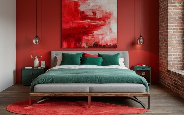
Let me tell you about one of my favorite design tricks: the cherry-red accent wall. I recently transformed a client’s living room by painting a rich cherry-red wall behind their cream-colored bed. The result? Stunning. The key is choosing the right wall. I always look for natural focal points in the room.
Here’s a pro tip I’ve learned through experience: cherry red accent walls work best in rooms with plenty of natural light. I’ve seen too many people try to force it in small, dark spaces, and it doesn’t have the same impact. I often suggest incorporating cherry red through artwork or accessories when working with smaller rooms.
The Magic of Ombre

One of my preferred techniques is to create cherry red ombre walls. By blending three to five shades of cherry, ranging from dark to light, you can achieve a stunning visual transition in the area. Although this technique is more complex than a typical paint job, the outcome is rewarding.
For a contemporary effect, consider opting for a matte finish; alternatively, a satin finish adds a touch of elegance.
Wallpaper Wisdom

After years of installing various wallpapers, I can tell you that cherry-themed patterns are incredibly versatile. In my projects, I’ve used everything from delicate cherry blossom prints in bedrooms to bold geometric patterns with cherry accents in home offices.
The secret is scaling the pattern to your space – I always tell my clients that larger rooms can handle bigger, bolder patterns, while smaller spaces need more delicate designs.

Furniture Choices

When it comes to cherry wood dining tables, I have a special place in my heart for their timeless appeal. I have one in my own home that’s been passed down through generations, and it just gets more beautiful with age. The natural reddish-brown tones create this incredible warmth you can’t replicate with other woods.

As for upholstered pieces, I recently helped a client select a gorgeous cherry red velvet sofa for their living room. It became an instant conversation starter! But I am always cautious about balance. If they’re going for a bold cherry red sofa, keep their walls and accessories neutral to let that beautiful piece shine.
The Power of Accent Chairs

I’m absolutely in love with what a cherry accent chair can do to a space. In my design practice, I often use them as “personality pieces” – like jewelry for your room. Here’s what I’ve learned about choosing the right cherry accent chair: texture is everything.
I often select velvet for formal living rooms—it catches the light beautifully and adds incredible depth to the cherry color. For more casual spaces, I recommend textured linens or performance fabrics, especially for clients with kids or pets.
The Art of Throw Pillows

I have a secret about throw pillows—they’re my favorite way to experiment with cherry red without commitment. If you’re nervous about incorporating bold colors, start here. Mix and match different styles and sizes to create a personalized look. The key is varying the textures, colors, and sizes.
I’ve learned a pro tip: don’t just plop them on the sofa. I arrange them in “coordinated chaos” —some forward, some back, mixing sizes and patterns while maintaining the cherry theme. Trust me, it makes all the difference!
Area Rugs: The Foundation Piece

I get so excited when clients are open to cherry-toned rugs because they can transform a space from the ground up. Recently, I worked on a project where we anchored a neutral living room with a gorgeous Persian-style rug featuring deep cherry accents. It tied everything together beautifully.
Here’s my tried-and-true formula for rug sizing: In a living room, make sure at least the frontal furniture pieces sit on the rug. For dining rooms, the rug should extend at least 24 inches beyond the table’s edge so chairs don’t catch when pulled out. These little details make such a difference in how the space feels.
Curtains: The Subtle Statement

When it comes to cherry-patterned curtains, I always say less is more. In my projects, I often use “whisper prints”—subtle cherry blossom patterns or geometric designs in which cherry red appears as an accent rather than the main event. I recently installed the most beautiful sheer panels with a delicate cherry blossom print in a client’s bedroom. When the light filters through, they create a magical effect.

Lighting the Way with Cherry

Let me share something that took me years to perfect: the art of colored lampshades. I love using cherry-colored shades because they create a warm, flattering glow perfect for evening ambiance. But here’s the catch: You must consider how the light will look day and night. I learned this the hard way early in my career!
I always test lampshades at different times of the day before finalizing my choice. A deep cherry shade might look perfect during the day but could cast too dark a glow at night. My solution? I often opt for ombré shades that transition from light to dark cherry or with metallic linings to reflect light better.
Pendant Lights

Do you know what’s been catching my eye lately? The creative ways we can use cherry red in lighting. Through trial and error, I’ve learned that height is crucial when using cherry red pendants. I typically hang them slightly higher than standard pendants because the color draws the eye.
In a recent project, I clustered multiple cherry-shaded pendants at different heights over a dining table, and the effect was like a piece of sculptural art!
Wall Sconces: Creating Drama

Can we talk about wall sconces for a minute? I’m passionate about using cherry red sconces to create “light sculptures” on walls. In a townhouse project, I lined a hallway with modernist cherry red sconces that created this incredible pattern of light and shadow. Their warm glow made the space feel like a high-end hotel corridor!
My go-to trick is often pairing cherry red sconces with metallic wallpaper or light-colored textured walls. The warm red light and the wall surface create a gorgeous, subtle dimension that photos can’t capture.
Art and Nature

There’s something magical about cherry blossom artwork – I’ve seen it completely transform spaces. In my own home, I have a large-scale cherry blossom painting that I found at an artists’ market. It’s become this incredible conversation starter, and I love how it brings this sense of organic movement to the room.
When helping clients select cherry blossom artwork, I always consider scale and color intensity. For instance, I recently helped a client create a gallery wall by mixing traditional Japanese cherry blossom prints with modern interpretations. The variety in styles creates a fantastic visual story.
Decorative Bowls

I share a styling secret I use in almost every project: layering cherry red decorative pieces at different heights. I recently styled a client’s bookshelf utilizing a collection of cherry red ceramic bowls in varying sizes and shades. I placed them strategically among old books and other objects to create beautiful moments of color that draw the eye across the shelf.
Sculptures or Figurines

I love playing with unexpected placements for sculptures. One of my favorite installations was a modern, abstract cherry red sculpture we placed in a traditional room. The contrast between classical and contemporary created such an interesting dialogue!
Kitchen Cabinets

Now, let’s talk about something bold: cherry-red kitchen cabinets! You can complete a kitchen renovation using cherry-red lower and upper cabinets. The result is stunning! Here’s my pro tip: the key to making cherry-red cabinets work is balancing them with plenty of neutral space. Use a white quartz countertop and a subtle gray or cream backsplash to let the cabinets be the star.
Backsplash with Cherry Accents

Speaking of backsplashes, I love using cherry red as an accent rather than the main event. In a kitchen, you can install a white backsplash with a cherry pattern, but don’t forget to use cherry red grout – it creates an incredible pattern that adds just the right amount of color without overwhelming the space.

Dining in Style

Want to know my favorite way to incorporate cherries into dining sets? Mix and match! Pair a classic cherry wood dining table with chairs upholstered in cherry red fabric. This creates a rich, layered appearance that wonderfully blends sophistication with a playful spirit.
Cherry Patio Furniture

Let me tell you about the outdoor transformations. You can turn a lackluster patio into an incredible entertaining space by using cherry red as our anchor color. Here’s a pro tip I’ve learned: treat it like jewelry for your outdoor space when working with cherry red patio furniture – a little goes a long way! For durability, I always recommend performance fabrics for outdoor cushions.
Planter Magic

I love creating what I call “color echoes” with planters. Arrange cherry red planters of varying heights filled with cascading green plants. The contrast between the vibrant containers and lush greenery is stunning! Group planters in odd numbers—it’s one of those design principles that works.
I’ve found that glossy ceramic planters in cherry red create a striking focal point, especially when they catch sunlight. They’re like garden jewelry! Just make sure they have proper drainage. I learned that lesson the hard way early in my career.
Outdoor Rugs

Want to know my secret for making an outdoor space feel like an extension of your home? A well-chosen outdoor rug! I recently used this gorgeous indoor/outdoor rug with a subtle cherry red pattern for a client. It transformed a concrete slab into this incredibly cozy outdoor living room.

Seasonal Color Stories


Layer different red textures for a festive holiday look without being overly themed—pair cherry red with fresh whites and soft pinks in spring for a stunning effect. Use cherry red in outdoor settings during summer, incorporating throw pillows and lanterns made of weather-resistant materials for durability. And for the winter, who does not like cherry-colored globes in a Christmas tree?
Color Pairing Secrets

Through years of experimentation, I’ve learned that cherry red sings when paired with the right neutral color. Use a warm, greige wall color with cherry red accents to create an incredibly sophisticated look everybody will love. The secret is using each color intentionally and adding plenty of neutral space to let it breathe.
Complementing with Greens

Brighten the lighter cherry color with lush greenery, such as houseplants, beautiful floral arrangements, or cheerful green accents. This delightful color combo brings a fresh and energizing feel to any space!

Mixing with Bold Colors

Create a playful and energetic atmosphere by mixing cherry with other bold colors, such as turquoise, yellow, and teal. This color combination is perfect for creating a vibrant and dynamic Boho space.
DIY Magic

Want to hear about my favorite DIY cherry red project? I recently guided a client through transforming an old wooden dresser using this gorgeous cherry red milk paint. We distressed it slightly to let some of the original wood peek through – it became this incredible statement piece that looks like it came from a high-end antique store!
Creating Your Art Pieces

Unleash your creativity by creating cherry-inspired artwork like abstract paintings or vibrant collages. This is a fun and rewarding way to express your artistic side. If you’re not an artist, go to Etsy for a large variety of paintings.
Upcycling Old Furniture

Give new life to old furniture by upcycling them with cherry-colored finishes, such as upholstery, paint, stain, or decoupage—a real sustainable and eco-friendly way to refresh your home décor.
Unforgettable Entrance

Incorporate cherry red into your home’s entryway to make a bold statement and leave a lasting first impression. A vibrant cherry red front door instantly catches the eye and exudes warmth, energy, and sophistication. For a cohesive look, complement the door with accents like red planters, a matching welcome mat, or a seasonal wreath that ties in the color.
Bookshelf Beauty

Now, let’s talk about another favorite way to use cherry red—bookshelves! You can paint the built-in shelves in this gorgeous cherry red, transforming the room from pleasant to extraordinary. When going bold with shelving color, the key is to create breathing room in your styling. I like to alternate between vertical and horizontal book arrangements, mixing in white ceramics and brass objects to break up the color blocks of books.
Kitchen Confidential

Let me share something exciting about cherry red in kitchens—it’s all about strategic pops of color! I recently helped a client curate their kitchen with cherry red appliances, but here’s the trick: we didn’t go overboard. We chose a stunning cherry red color refrigerator as our anchor piece, echoing that color with smaller items like a mixer, toaster, and a washing machine. Spacing these red elements around the kitchen is key to creating a beautiful visual rhythm.
Lacquer Love

I recently worked with an artisan to create this incredible cherry red lacquered credenza for a client’s dining room. The process involved multiple layers of paint and lacquer, each hand-sanded between coats. The result? This mirror-like finish practically glows from within. It’s become such a statement piece that my client regularly sends me photos of their dinner guests admiring their reflections!
Bathroom Brilliance

Most people don’t realize that the bathroom is an incredible place to play with cherry red! I recently designed a bathroom in which everything was crisp white except for the cherry-red textiles and accessories. The effect was both energizing and sophisticated.
Cherry and Gold Accents

Let me share my favorite color combination – cherry red and gold! The warmth of the gold brings out these incredible undertones in the cherry red that you might miss otherwise. For a recent client, we even had custom throw pillows made with cherry red velvet on one side and a subtle gold pattern on the other – pure luxury!
The Drama of Black and Cherry

Want to create instant drama? Pair cherry red with black! In a recent bedroom project, I used black sheets and pillows with subtle textures as the background and added cherry red over the whole room. The contrast was stunning! I also love using black picture frames around cherry red artwork—it creates a beautiful contrast that draws the eye.
Workspace Wonders

Let me tell you about transforming offices with cherry red. I recently designed an office space with a cherry red desk as the centerpiece, but here’s the twist: we kept everything else incredibly neutral. The desk became a powerful focal point that energized my client while working. I’ve found that cherry red in a workspace can boost creativity and productivity—there’’s some fascinating color psychology behind it!
Interior Door Impact

Here’s a bold move that always pays off: painting interior doors cherry red while keeping the walls light gray or cream. The effect is phenomenal! It’s like having art pieces you interact with throughout your home daily. Just use high-quality paint that can handle frequent touching and cleaning.
Would you like to hear more about connecting all these furniture elements? I have some great stories about creating cohesive color stories throughout homes.


Add comment