

Fresh starts and brighter days

Dan S. Morris is the Chief Content Editor and founder of Chosen Furniture. He covers high-quality furniture products designed to last, so he is the best contact for house goods advice.
Spring 2025 doesn’t whisper—it sings. This year, your home isn’t just getting a refresh; it’s staging a revolution.
Picture hues that crackle with the energy of a thunderstorm melt into the calm of a lazy Sunday or blush like your favorite vinyl album’s cover. Forget “safe” neutrals and tired pastels.
The palette of the moment? Colors that dare your walls to stop being background noise and start radiating personality.


From moody Lavender Storm (ideal for midnight brainstorming sessions) to Buttercream Boldness (the shade that turns clutter into “curated chaos”), we’re diving into the 13 hues that’ll make your space feel less like a showroom and more like a living, breathing scrapbook of you.
Buckle up—this spring, beige is officially canceled.
Mint Green Euphoria: Serenity with a Twist

Mint green isn’t just a color-it’s a deep breath for your soul. This spring, we’re ditching the predictable and embracing its versatility. Picture a kitchen where matte mint cabinets glow under pendant lights, their coolness balanced by brass handles whispering, “I’m fancy but approachable.“
Last month, I paired this hue with a terracotta backsplash in a sunroom-it felt like a Mediterranean garden meeting modern minimalism. The client texted me later: “My morning coffee here tastes like vacation.” For drama, paint your ceiling mint-it’s like lying in the grass without the pollen.
Not ready to commit? Try minty shelves with burnt-orange ceramics or a mint-framed mirror that turns reflections into art. This shade thrives in dim corners, too, bouncing light like a prism.
Pro tip: Add velvet mint throw pillows to a charcoal sofa-suddenly, your Netflix nights feel curated.
|
MUST READ: |

Coral Blush Rebellion: The Quiet Disruptor

Coral blush is the lovechild of a sunset and a peach-warm, inviting, and quietly rebellious. It’s the shade that says, “I’m soft, but I’ll fight you for my boundaries.” Last winter, I draped a coral velvet sofa in a minimalist loft and tossed charcoal pillows. The client gasped, “It’s like my space learned to blush.“
Use it in a nursery with sage crib sheets for a gender-neutral oasis, or slather it on a front door to make Amazon deliveries feel like grand gestures. If you’re obsessed with maximalism, pair it with emerald wallpaper-it’s tropical without the kitsch.
Coral blush also works well with metals: Rose gold lamps make it glow, while black iron fixtures keep it grounded. Test it in a hallway nook with a coral stool and a stack of art books-the pause your home didn’t know it needed.
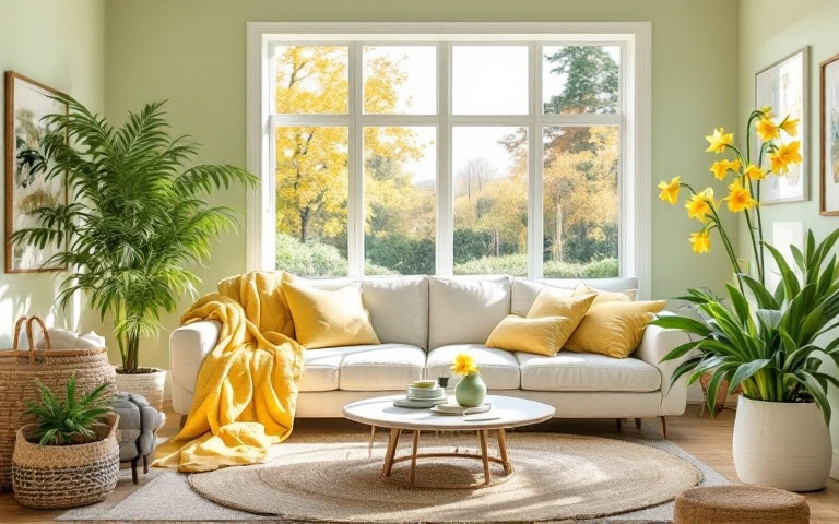
Sunflower Yellow Reign: Joy, Amplified

Yellow isn’t just happy-it’s a middle finger to gray skies. This year, we’re using it fearlessly. Imagine a black-and-white entryway with a sunflower console table that screams, “Welcome! Now, take off your shoes. A client’s navy bedroom got mustard linen curtains, and she joked, “Now my 6 AM alarms feel less tragic.“
For skeptics, start tiny: a yellow teapot, a lemon-shaped vase, or a throw blanket with golden tassels. Sunflowers pair magically with raw wood-try a yellow bench at a farmhouse table. In-home offices are productive in paint form; one writer told me her yellow accent wall “makes writer’s block panic and leave.
Warning: This color is contagious. Your kitchen nook might demand yellow stools, and suddenly, you’re the neighbor who radiates.
|
MUST READ: |

Lavender Storm: Moody Magic

Lavender Storm is for those who want mystery without the goth phase. It’s the color of twilight hikes and unread poetry books. I bathed a bedroom in this hue, layered charcoal linens, and hung a chandelier with amethyst droplets.
The homeowner whispered, “It’s like sleeping inside a David Lynch film.” Use it in a dining room with matte black chairs-your pasta nights will feel cinematic. Too bold? Paint the back of a bookshelf; your novels will pop like gallery art. Pair it with mauve candles or a graphite rug to keep it from floating away.
Pro tip: Lavender Storm loves textured walls-try a limewash finish for a stormcloud effect.
Sky Blue Rebellion: Break Free from Basic

Sky Blue is ditching its “nursery” rep and growing a backbone. Last week, I styled a bachelor pad with a glossy sky-blue media unit. Paired with leather stools and a vintage guitar, it screamed, “I cook steak and cry at rom-coms.“
Layer it with oatmeal throws and a single tangerine pillow for cozy vibes-it’s sunset in a room. Test it in a bathroom with cloud-shaped mirrors, or go edgy with sky-blue kitchen cabinets and stainless steel. It’s surprisingly low-maintenance, hiding dust like a pro.
|
MUST READ: |

Terracotta Thrive: Earthy & Electrifying

Terracotta is the color of desert sunsets and your favorite mug. It’s warmth with a PhD in coziness. I plastered a bathroom in terracotta and added flickering candles, and the client said, “My showers now feel like spa sabotage.“
Pair it with turquoise tiles for a Santa Fe vibe, or use terracotta planters to make your fiddle leaf fig look expensive. In kitchens, it makes copper pans glow. Try it on an accent wall behind your bed-waking up feels like a hug from the earth.

Lilac Gray Revolution: Neutral, but Not Boring

Lilac Gray is the quiet kid who secretly writes award-winning poetry. It’s a neutral that blushes. I painted a sectional of this shade, and the living room became “where we talk instead of scrolling.“
Pair it with gold star decals in a nursery-dreamy without Disneyfying. Use it on a kitchen island with marble counters; your coffee ritual will feel Parisian.
Pro tip: It’s a chameleon-it looks lavender at dawn and gray by noon.
|
MUST READ: |

Peach Nectar Dive: Warmth in Every Shade

Peach nectar is a sunset you can touch. I swathed a breakfast nook in peach linen curtains and added sage plates, and the client sighed, “My avocado toast tastes happier here.” It’s magic with wood tones-try peach cushions on a walnut bench.
Use it in a hallway with a vintage mirror; suddenly, checking your hair feels nostalgic. Paint your ceiling peach for bravery-like kissing the sky goodnight.

Seafoam Green Riptide: Coastal Meets Cool

Seafoam green evokes relief, like kicking off shoes after a long day. Imagine a downtown loft with built-in shelves holding noir photography, the moody prints softened by this tranquil hue. At golden hour, the seafoam glows like shallow ocean waves, while at night, under warm bulbs, it hums a lullaby.
Try it in a bathroom with brass faucets-suddenly, brushing your teeth feels like a scene from a Wes Anderson flick. Or paint your porch ceiling seafoam; when rain patters against it, you’ll swear you hear the distant crash of tides. Even your grumpy cat will curl up on a seafoam ottoman as if it’s suddenly discovered inner peace.
|
MUST READ: |

Buttercream Boldness: The New Neutral

Buttercream is the color of your childhood teddy bear-worn-in, warm, and always there to catch you. I painted a client’s dining room trim this shade, and she tearfully admitted, “Now Sunday pasta dinners feel like my nonna’s kitchen.” It’s not just a backdrop; it’s a mood alchemist.
In a sunlit reading nook, buttercream walls turn tattered paperbacks into gilded treasures. For a writer’s studio, we paired a buttercream rug with a storm-gray desk, and she joked, “My deadlines feel less apocalyptic here.“
Buttercream is the shade that forgives cluttered shelves and elevates thrift-store frames. Try it on stair risers-each step feels like a buttery slice of toast. And yes, that buttercream armchair? It’s the one guests fight over as if it’s secretly dispensing hugs.
Fresh Sage: Nature’s Whisper

Sage green is the color of your first sip of herbal tea after a chaotic day-gentle, grounding, and quietly revolutionary. A once sterile white box, a client’s kitchen became a sanctuary when we painted the cabinets sage and added brass pulls.
She texted me a photo of her toddler “helping” her bake, captioned: “Now even spilled flour looks intentional.” In a bedroom, sage linen sheets feel like sleeping in a meadow (minus the bugs). Pair it with a rattan headboard; waking up feels less like an alarm and more like a slow stretch in a treehouse.
For the skeptics, paint just your pantry door sage. When you open it, your cereal boxes will look like a still-life painting.
Pro tip: Add a sage throw to your couch-suddenly, binge-watching feels like self-care.
|
MUST READ: |

Creamy White: The Silent Hero

Creamy white is the color of your favorite oversized sweater-humble but the thing you reach for when life feels loud. We painted the walls in a cluttered family room this shade, and the client gasped: “The kids’ toys look curated now, not chaotic.“
It’s the ultimate wingman for heirlooms-your grandpa’s dusty violin? Suddenly, a museum piece. At dawn, it drinks in the pink sunrise; by candlelight, it flickers like a vanilla-scented dream. Try it on a ceiling with exposed beams-like floating on a cloud with great bones.
And in a hallway lined with creamy white? Your collection of mismatched frames becomes a gallery, not an “I’ll hang that later” graveyard.

Soft Pastel Pink: Subtle & Sophisticated

This pink is the color of your cheeks after a compliment-warm, fleeting, and fiercely genuine. In a loft with concrete floors, we brushed walls with this hue, and the client (a tattooed bar owner) grinned: “My friends think I’ve gone soft. Joke’s on them-it’s like a hug for my steel-toe boots.“
Use it in a close; even your wrinkled band feels intentional. Pair it with a charcoal sofa, and it’s the visual equivalent of a whispered secret. Try pastel pink towels against slate tiles for a bathroom-suddenly, post-shower lotion routines feel like spa rituals.
And that pink lampshade? It casts a glow that makes everyone look like they’ve slept eight hours.
Crafting a Space That Reflects Your Unique Story
Your home isn’t a showroom-it’s the scrapbook of your life. That seafoam shelf? It’s where you’ll display seashells from the vacation that healed you. The buttercream chair? That’s where you’ll sob over breakups and belly-laugh over wine.
Paint the door pink, hang the rug your kid doodled on, and let the scuffs on your sage walls tell tales of dance parties and DIY fails. Perfection is overrated; life is the trend. Let’s celebrate homes that look lived in, not staged.


Add comment