
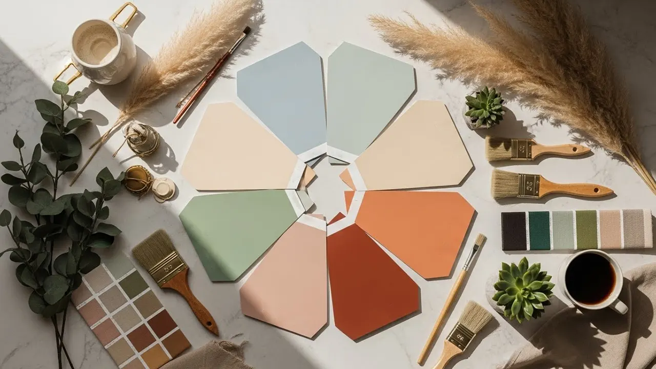
Why are these colors suddenly in every DIY and high-end project? We reverse-engineered the algorithm to give you the ultimate decor shortcut!

Dan S. Morris is the Chief Content Editor and founder of ChosenFurniture. He covers high-quality furniture products designed to last, so he is the best contact for house goods advice.

Kate Wilson is a writer and fact checker for home decor and furnishings at ChosenFurniture. She enjoys splitting her finds with others.

Sarah Morris is an avid writer specializing in home decor and product reviews. She covers furniture products and more for Chosen Furniture.
What paint colors will define home decor in 2026?
According to AI chat analysis of global interior design trends, search behavior, and emerging lifestyles, the answer is a mix of calming modern neutrals and expressive, forward-thinking hues – nine standout shades that are already shaping the future of interior design.
After the success of our 2025 AI color palette list, driven by Pantone’s Cloud Dancer color of the year choice, we are back with a fresh new top.
Consider this your heads-up, home decor and interior design lovers – your walls and home are about to enter a brilliant new era.
Key Takeaways: AI Colors of 2026
- AI consensus favors complex neutrals with warmth; colors that shift subtly with light and feel calm without reading flat or dull.
- Soft, atmospheric hues outperform brights, reflecting a collective move toward emotional comfort, longevity, and livable sophistication.
- Nature-coded colors dominate 2026, with mineral, clouded, and earth-inspired tones replacing literal greens and blues.
- Trending shades are intentionally versatile, designed to work across open plans, multiple rooms, and changing furniture styles.
- AI predicts fewer “statement walls” and more immersive color use: walls, ceilings, and trim working together for cohesive depth.
AI-Predicted, Expert-Approved
The 2026 paint color landscape reflects a decisive shift toward emotional comfort and sophisticated restraint. Pantone’s 2026 Color of the Year, Cloud Dancer, a luminous white that symbolizes calming influence and relief from overstimulation, sets the tone for the year ahead.
Complementing this philosophy, Sherwin-Williams selected Universal Khaki as its Color of the Year – a warm, mid-tone neutral that provides both comfort and stability.
Benjamin Moore’s Color Trends 2026 palette emphasizes timeless classics and thoughtful layering, featuring Silhouette AF-655 as a luxurious burnt umber with delicate charcoal notes.
Beyond the major paint manufacturers, data from Pinterest’s 2026 color forecast reveals a more diverse palette, with trending colors including Persimmon, Cool Blue, Jade, Plum Noir, and Wasabi, reflecting user search behavior and design interests across fashion, beauty, and interiors.
According to HGTV Home, warm, grounded neutrals alongside statement-making deeper tones, while industry analysts at Krion highlight the dominance of warm, natural colors such as terracotta and earth tones, reflecting a return to authenticity and nature-inspired design.
Our AI-driven analysis, validated by lead editor Dan S. Morris, home decor specialist Kate Wilson, and fact-checked by Sarah Morris, synthesizes industry forecasts with emerging global trends to deliver the most livable, sophisticated, and forward-thinking paint colors poised to shape interiors throughout 2026.
NOTE: We use services from ChatGPT, Claude, Gemini, Copilot, Grok, and Perplexity. The results are displayed alphabetically (we do not want to favor anyone).
Each option includes an approximate hex color code (a six-digit alphanumeric value used on the Internet to define precise colors, e.g., #b5d334) and the corresponding colors from top paint color brands (exact hex code varies by brand).
IMPORTANT: Colors vary across screens due to display technology, color profiles, and calibration.
Trending Paint Colors of 2026 by ChatGPT (chatgpt.com)
According to ChatGPT, paint color trends reflect a shift toward balance, warmth, and emotional comfort. The focus is on versatile tones that feel grounded yet expressive, supporting both calm interiors and confident statements. These colors work across styles, enhance natural light, and encourage thoughtful layering, making homes feel more personal, timeless, and quietly optimistic rather than overly dramatic or trend-driven.
Dusty Sage Green (hex #5f7769)
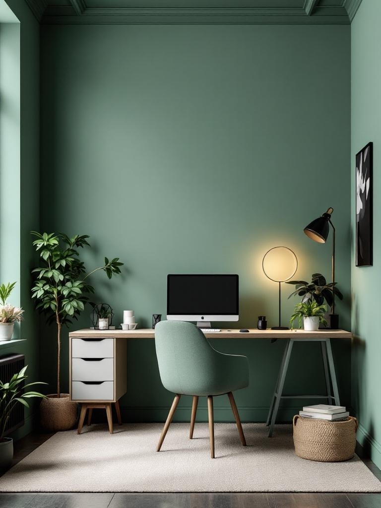
Dusty Sage Green mixes calm sage green with a cooler, slightly techy twist. The color feels soothing enough and works beautifully in modern, minimalist, and rustic spaces. I pair it with warm white trim and black hardware, and everything suddenly feels expensive. Ever want a room that whispers “zen” but still looks smart on Zoom? This shade nails that.
Use any of these brand colors, or combine them with others.
- Sherwin-Williams: SW 9130 Evergreen Fog
- Benjamin Moore: 1495 October Mist
- Behr: N390-2 Sage Gray
- Valspar: 8003-33C Salon Green
- Farrow & Ball: No. 47 Green Smoke
- Pantone: 20-0180 TPM Satin Moss
Smoky Mushroom Greige (hex #a79b8c)
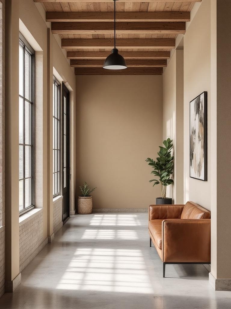
Smoky Mushroom Greige keeps greige alive but adds depth and shadow. I have to admit, this color works perfectly when you want one shade to run through your whole place. It lets bold art, vintage pieces, and weird rugs stand out without fighting them. You basically cheat your way to a “designer neutral” instead of boring landlord beige.
Feel free to use any of these colors or mix with others.
- Sherwin-Williams: SW 7022 Alpaca
- Benjamin Moore: AF-100 Pashmina
- Behr: PPU24-11 Ashen Tan
- Valspar: 6005-1B Villa Grey
- Farrow & Ball: No. 293 Jitney
- Pantone: 14-1305 TPX Mushroom
Muted Terracotta (hex #be725a)
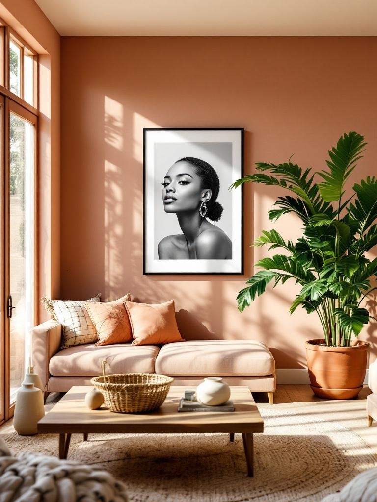
Muted Terracotta is a soft, desaturated version of classic terracotta. It tones down the vibrancy of brighter terracottas, blending earthy rust with subtle brown and pink undertones for a cozy, grounded feel. This color evokes comfort, nature, and timelessness, making it ideal for creating inviting spaces without overwhelming intensity. Ever notice how this tone flatters faces in photos?
Select a single brand color or combine several complementary shades.
- Sherwin-Williams: SW 7701 Cavern Clay
- Benjamin Moore: 1221 Potter’s Clay
- Behr: S180-5 Auburn Glaze
- Valspar: 2005-5B Copper Hide
- Farrow & Ball: No. CC8 Faded Terracotta
- Pantone: 17-1430 TCX Terracotta
Cloud Dancer (hex #f0eee9)
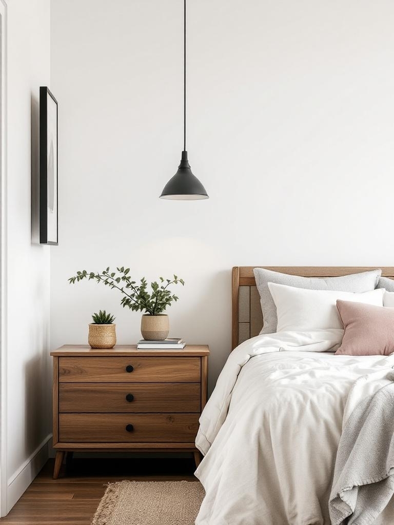
Cloud Dancer (Pantone’s color of the year 2026) is an airy, luminous neutral that softens spaces without feeling cold. Use it on walls, ceilings, or cabinetry in living rooms, hallways, studios, and open plans. I would pair with natural wood, warm whites, honed stone, linen textiles, brushed brass, and subtle mineral accents for calm, modern warmth while preserving balance and lived-in elegance.
Pick one signature shade, or curate a small palette of colors that naturally work together.
- Sherwin-Williams: SW 7008 Alabaster
- Benjamin Moore: OC-65 Chantilly Lace
- Behr: 73 White Veil
- Valspar: 7006-24 Swiss Coffee
- Farrow & Ball: No. 2005 All White
- Pantone: 11-4201 Cloud Dancer
Inky Blue-Black (hex #0e1a24)
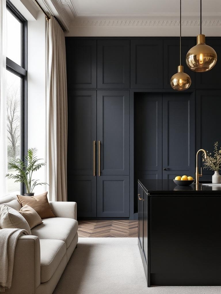
Inky Blue-Black walks the line between navy and black, feeling rich. I love it on bedroom feature walls, interior doors, and kitchen islands – give it some space to shine. The color creates drama without screaming for attention like bright accent walls. You add cream fabrics and warm metals, and suddenly the room gives boutique-hotel energy.
Choose one signature color or mix a few that work well together.
- Sherwin-Williams: SW 6237 Dark Night
- Benjamin Moore: 2127-20 Black Ink
- Behr: MQ5-05 Limousine Leather
- Valspar: 5011-2 Midnight Bay
- Farrow & Ball: No. 31 Railings
- Pantone: 19-4005 TC Navy Blazer
Universal Khaki (hex #b8a992)
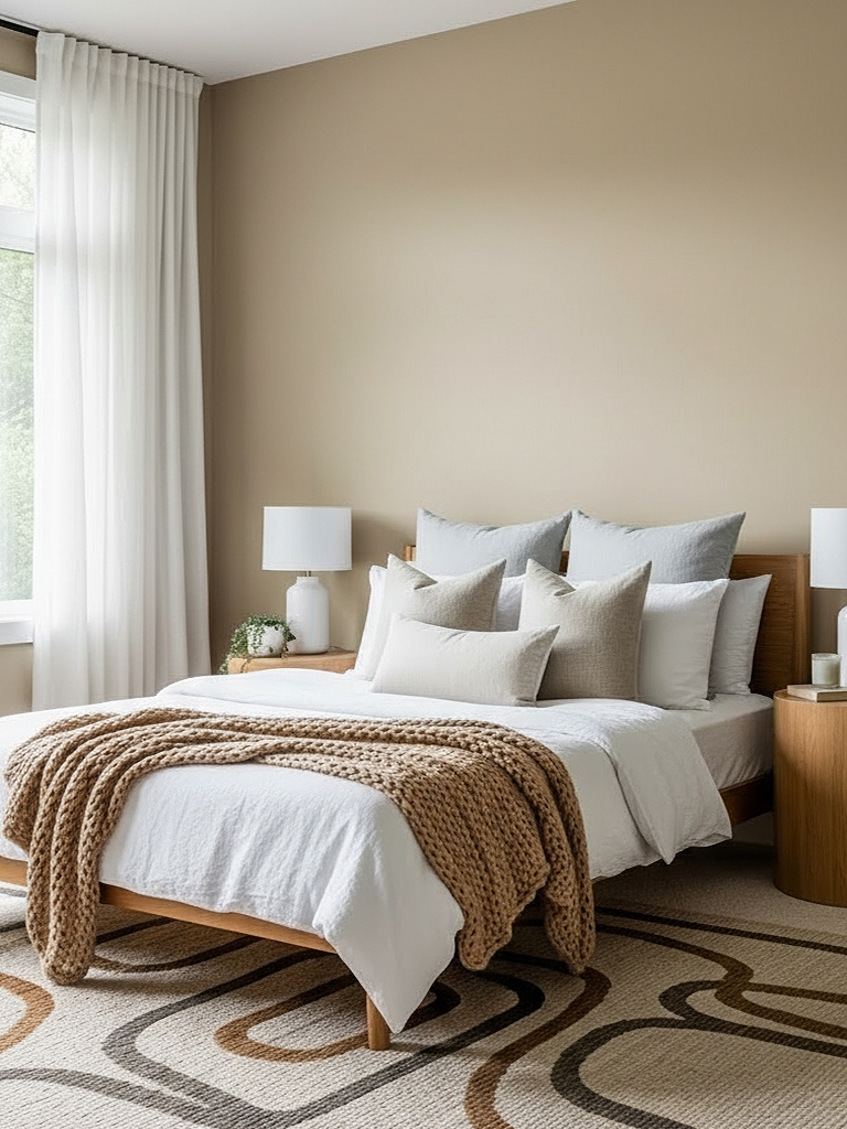
Universal Khaki (Sherwin-Williams SW 6150, the 2026 Color of the Year) is a warm, mid-tone neutral tan-beige with subtle green-yellow undertones. Earthy and versatile, it evokes timeless comfort and sophistication, ideal for cozy, grounded interiors. Perfect for living rooms, bedrooms, kitchens, and dining areas. Best in well-lit rooms; avoid very dark places where it may feel heavy.
Use a single brand shade or merge several coordinating colors.
- Sherwin-Williams: SW 6150 Universal Khaki
- Benjamin Moore: HC-114 Greenbrier Beige
- Behr: N310-4 Desert Khaki
- Valspar: 8004-18B Classic Khaki
- Farrow & Ball: No. 223 London Stone
- Pantone: 15-1214 TCX Tan
Deep Teal (hex #0f4c5c)
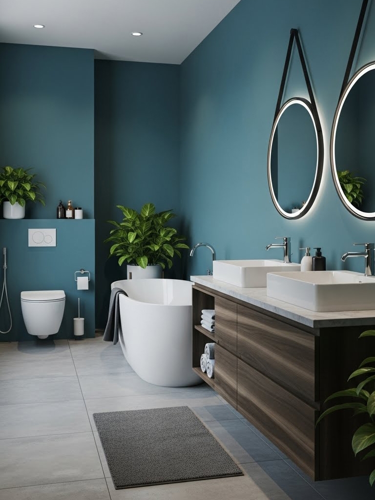
Deep Teal is a rich, dark blue-green hue evoking ocean depths. It is sophisticated, calming, and mysterious with cool undertones. Add some drama and elegance without overwhelming. Use for accent walls in living rooms or bedrooms, or kitchen/bathroom cabinets for bold elegance. I’d pair it with gold accents, crisp whites, natural wood, or soft grays to keep the look balanced and refined.
Commit to one defining color or create balance with a color blend.
- Sherwin-Williams: SW 6237 Dark Night
- Benjamin Moore: 2136-40 Aegean Teal
- Behr: MQ6-01 OCEAN ABYSS
- Valspar: 5011-3Everglade Deck
- Farrow & Ball: No. 288 Vardo
- Pantone: 19-4914 TCX Deep Teal
Cloudy Linen White (hex #f4f0e6)
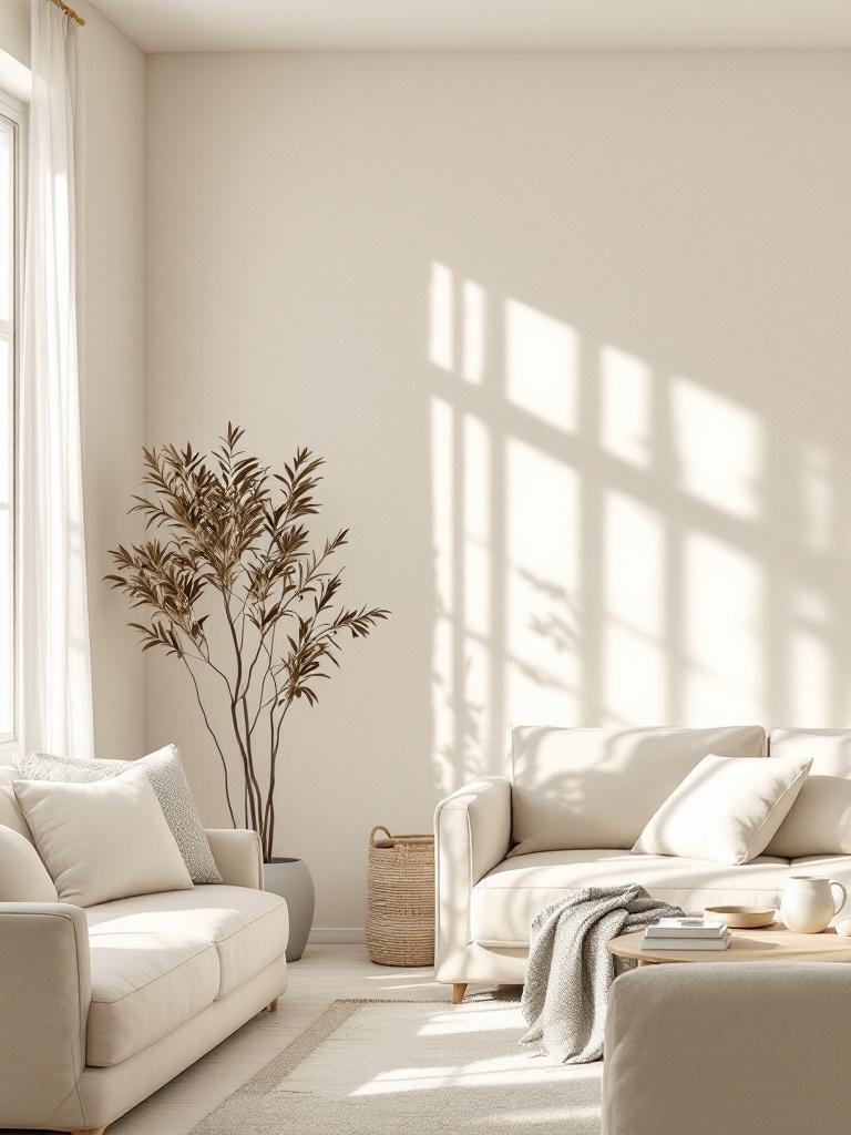
Cloudy Linen White replaces harsh gallery white with something softer and cozier. The color still reads clean, but it feels like the sun through a linen curtain. I use it when someone wants a safe, whole-house color that still feels warm. FYI, you always test this shade in different corners because lighting can make it appear more beige.
Opt for a standout brand color or a curated blend of harmonizing hues.
- Sherwin-Williams: SW 7008 Alabaster
- Benjamin Moore: OC-17 White Dove
- Behr: 12 Swiss Coffee
- Valspar: 7002-6 Du Jour
- Farrow & Ball: No. 2003 Pointing
- Pantone: 11-0105 TCX Antique White
Warm Mahogany (hex #764034)
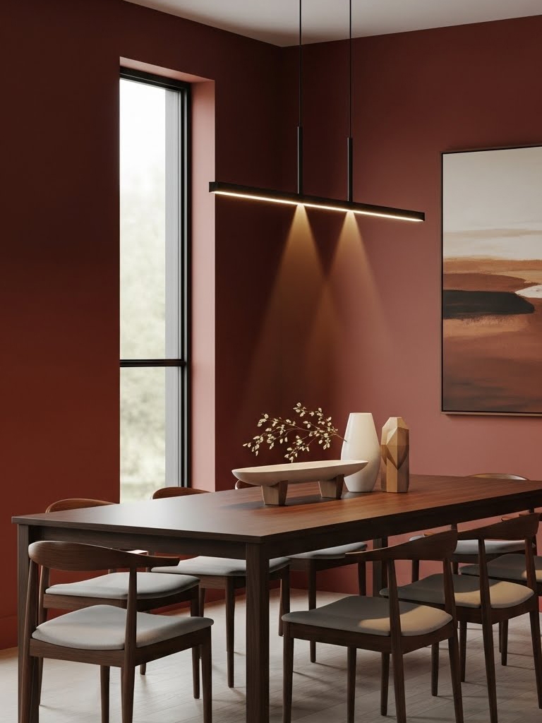
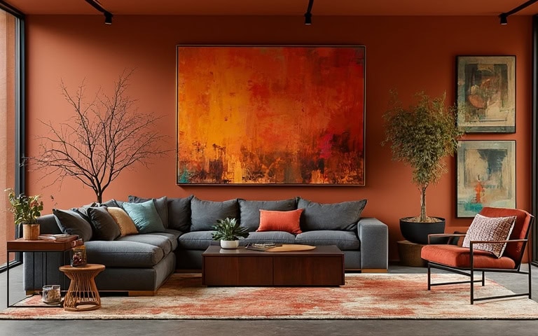
Warm Mahogany (Glidden’s color of the year 2026) is a rich, deep reddish-brown with warm undertones, evoking luxury and timeless elegance, like fine wood furniture. Use sparingly in home decor for accent walls, dining rooms, libraries, or bedrooms to create cozy, sophisticated depth. I’d try to pair it with creams, gold accents, or natural greens for an effortless harmony.
Go with one brand color or thoughtfully mix complementary ones.
- Glidden: PPG1060-7 Warm Mahogany
- Sherwin-Williams: SW 2838 Polished Mahogany
- Benjamin Moore: HC-64 Townsend Harbor Brown
- Behr: 170-7 Dark Cherry Mocha
- Valspar: 2002-9A Tavern Mahogany
- Farrow & Ball: No. W101 Deep Reddish Brown
- Pantone: 18-1425 TPG Mahogany
|
MUST READ: |
Trending Paint Colors of 2026 by Claude (claude.ai)
Based on Claude’s analysis of cultural trends, interior design embraces warmth and natural inspiration this year. Expect to see colors pulled from desert landscapes, botanical gardens, and coastal horizons dominating walls. The palette balances bold statement hues with soothing neutrals, reflecting homeowners’ desire for spaces that feel both energizing and restful. This year’s trends prioritize authenticity, comfort, and connection to the natural world around us.
Hidden Gem (hex #596d69)
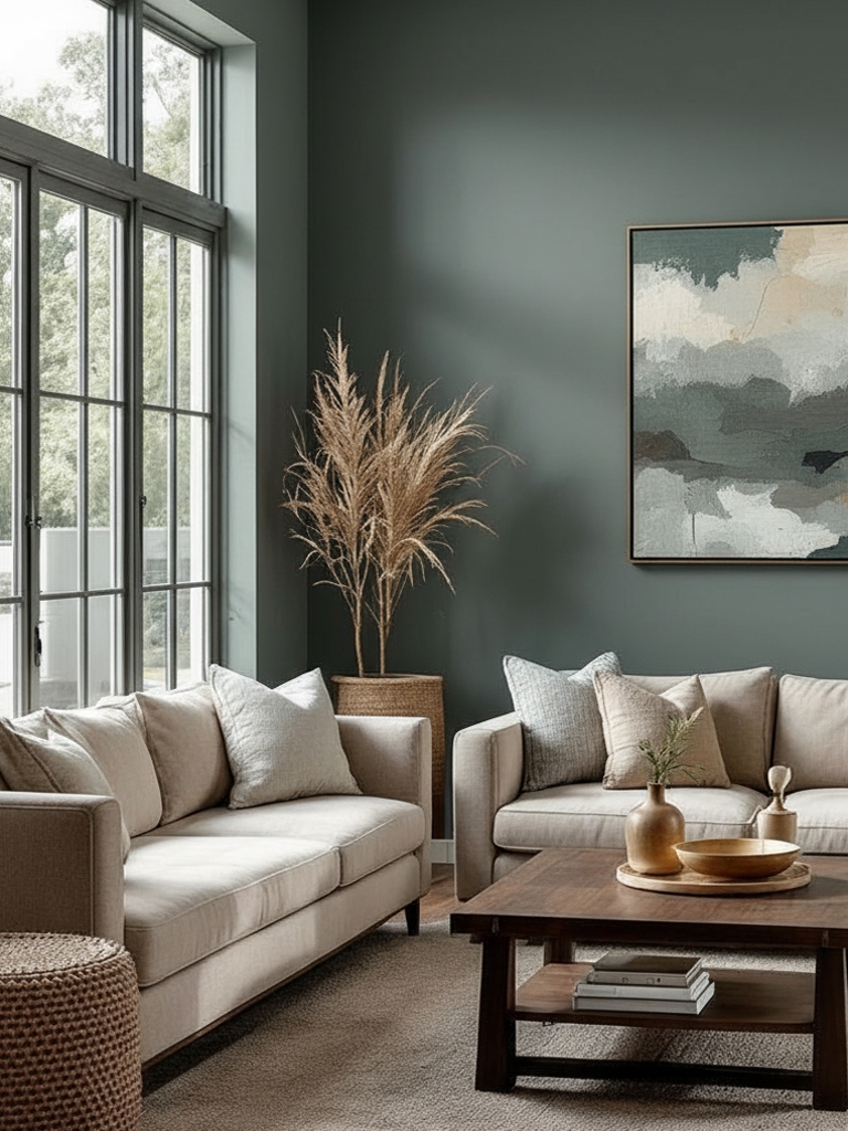
Hidden Gem (Behr’s color of the year 2026) is a smoky jade blue-green that strikes a perfect balance between drama and tranquility, reminiscent of polished gemstones with a matte finish. I think you can use it strategically in home offices, bedrooms, or powder rooms to create depth and visual interest without overwhelming the space. It pairs beautifully with brass fixtures, natural wood tones, or crisp white trim for a sophisticated, grounded aesthetic.
These shades work beautifully on their own or combined with other hues.
- Behr: N430-6A Hidden Gem
- Sherwin-Williams: SW 6207 Retreat
- Benjamin Moore: 686 Crisp Romaine
- Valspar: 5004-4B Blueridge Fir
- Farrow & Ball: No. 84 Green Blue
- Pantone: 18-5612 TCX Sagebrush Green
Epernay (hex #decea4)
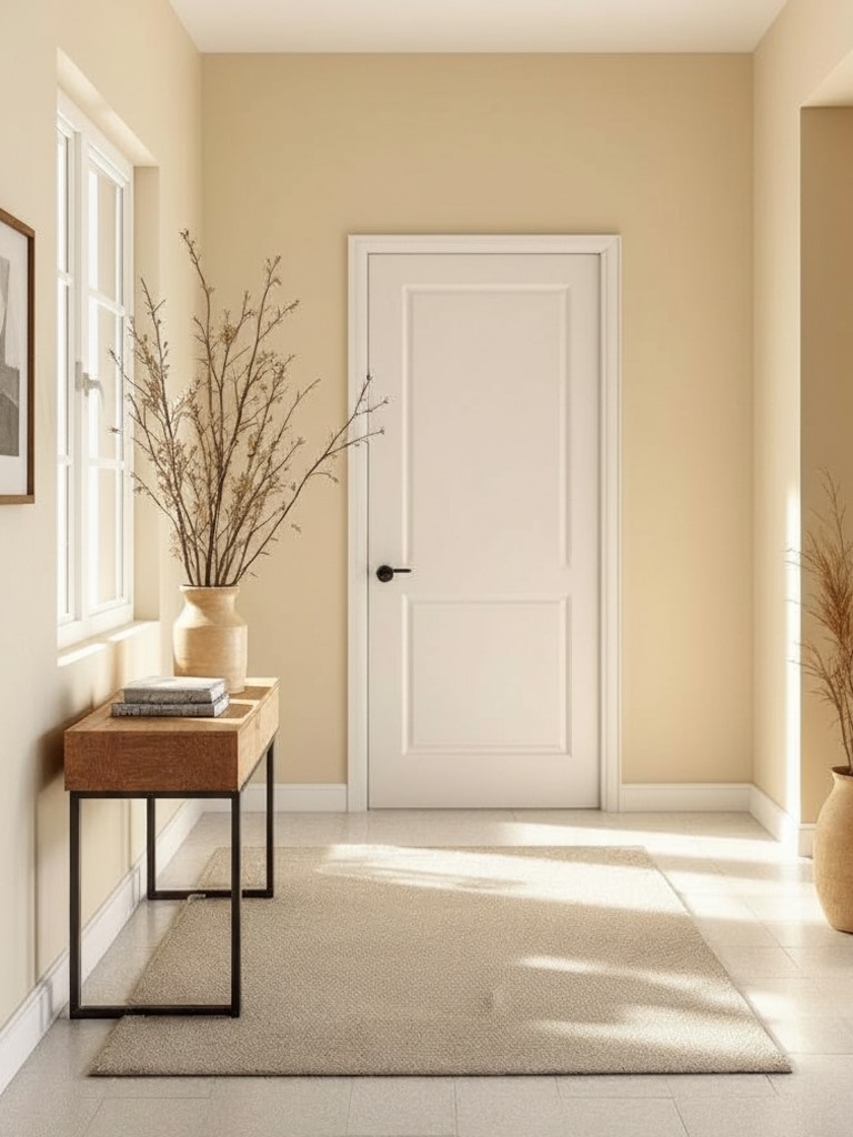
Epernay (C2 Paint color of the year 2026) is a refined, earthy soft ochre with mineral undertones, capturing the essence of French countryside architecture and sun-baked clay. Use it in kitchens, breakfast nooks, entryways, or living spaces to infuse warmth and European sophistication. It pairs wonderfully with deep charcoal, terracotta accents, or natural linen textures for a curated, traveled aesthetic.
These brand colors can stand on their own or be complemented by others.
- C2 Paint: C2-639 Epernay (Color of the Year 2026)
- Benjamin Moore: 2152-50 Golden Straw
- Sherwin-Williams: SW 6379 Jersey Cream
- Behr: P330-2 LIME BRIGHT
- Valspar: R119C Consommé
- Farrow & Ball: No. 52 Straw
- Pantone: 12-0830 TSX Pancake Batter
Divine Damson (hex #431e22)
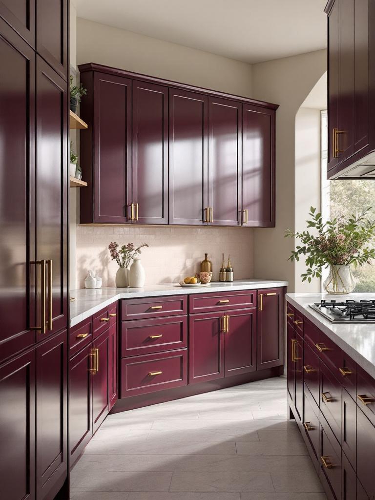
Divine Damson (Graham & Brown’s color of the year for 2026) is a deep plum with dark-cherry undertones, offering the richness of wine country with a modern, moody edge. Use it as a statement color in home bars, hallways, office accent walls, or even kitchen cabinetry for a bold yet refined look. In my opinion, it pairs with blush pinks, brushed-gold hardware, or soft grays for an opulent, layered effect. I will use it on projects that evoke luxury, elegance, and sophistication.
Try them on their own or mix them for a smooth, coordinated look.
- Graham & Brown: Divine Damson
- Benjamin Moore: 2075-10 Elderberry Wine
- Sherwin-Williams: SW 6565 Fabulous Grape
- Behr: S-H-680 Purple Bloom
- Valspar: 1011-6 Ancient Burgundy
- Farrow & Ball: No. 297 Preference Red
- Pantone: 19-2118 TCX Winetasting
Melodious Ivory (hex #e4caad)
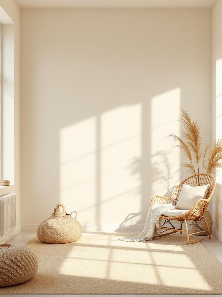
Melodious Ivory (Dutch Boy’s color of the year 2026) is a soft, creamy beige with warm undertones, radiating comfort and versatility like fresh linen or vanilla custard. I suggest to use it throughout your home as a primary wall color in living rooms, kitchens, bedrooms, or bathrooms for a timeless foundation that works with any design style. It pairs effortlessly with virtually any accent color, from navy and forest green to terracotta and charcoal.
Use them individually or blend them with other colors for a cohesive look.
- Dutch Boy: Melodious Ivory
- Benjamin Moore: OC-2 Pale Almond
- Sherwin-Williams: SW 7012 Creamy
- Behr: MQ3-43 CERAMIC BEIGE
- Valspar: 3007-6B Homey Cream
- Farrow & Ball: No. 203 Tallow
- Pantone: 11-4101 TCX Stalactite
Warm Mahogany (hex #764034)
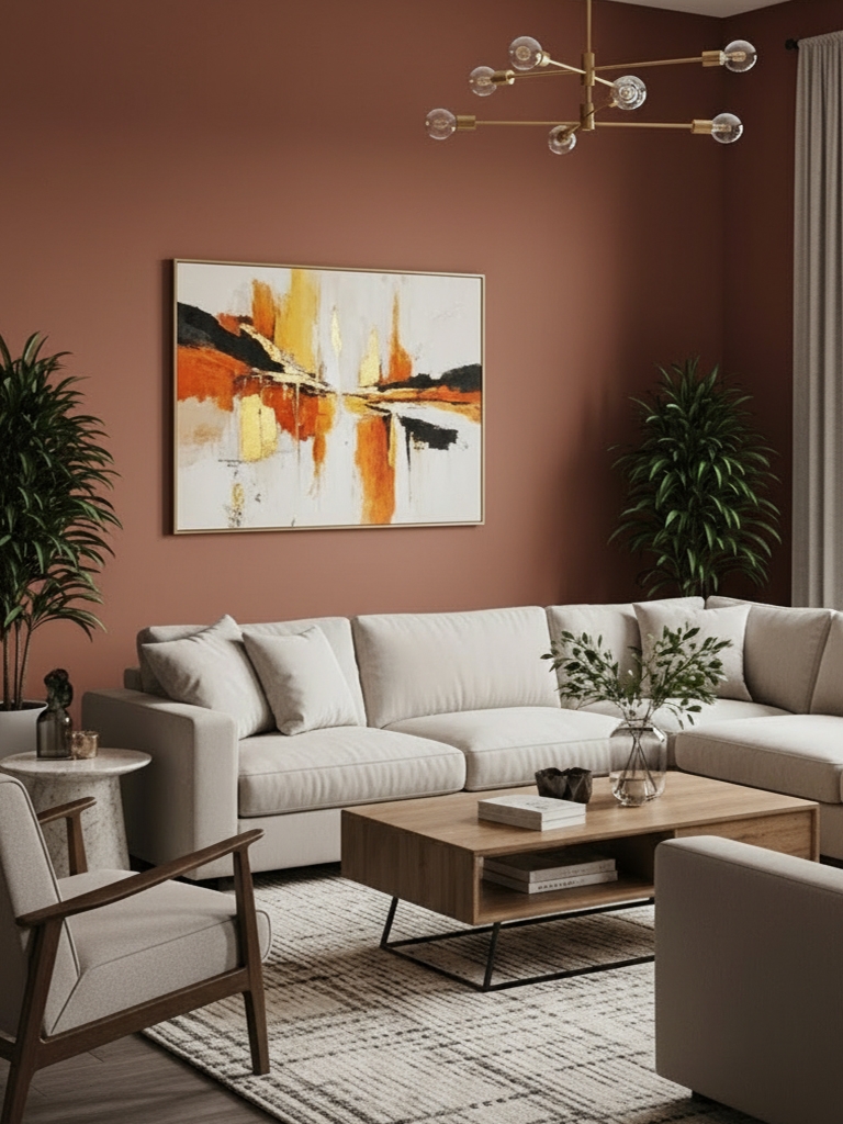
“The desire for increased social intimacy requires spaces that promote togetherness, a core design focus that moves away from abiding to trends and delivers refined aesthetics that feel timeless and classic. I encourage using Warm Mahogany in a big way – full walls and color drenching can make an incredible statement.” – Ashley McCollum, color expert at The Pittsburgh Paints Company
Warm Mahogany is a rich, deep reddish-brown with inviting warmth that instantly feels refined and grounded, like beautifully aged wood furniture. I love using it sparingly to add depth and quiet drama. It works exceptionally well on accent walls, in dining rooms, libraries, or bedrooms where intimacy matters. Paired with soft creams, brushed golds, or natural greens, it feels timeless, elegant, and deeply comforting.
Choose one brand paint color or merge with other multiple hues for a unified palette.
Cloud Dancer (hex #f0eee9)
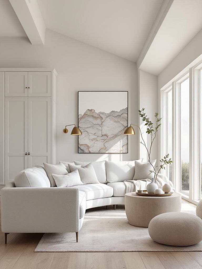
“My first reaction was that it is a gentle and quietly optimistic color,” says Jemimah Graff, CEO of Martin Kemp Design studio in a recent interview. “It has a softness that many people will find calming, but there is also a warmth that keeps it from feeling bland or overly safe. It bridges the ongoing desire for soft neutrals with a renewed appreciation for lightness and simplicity.“
Cloud Dancer drifts between light and substance like morning haze settling on stone. This pale neutral carries a quiet radiance that tempers interiors without tipping into sterility. I will apply it to walls, ceilings, and cabinetry in living rooms, corridors, studios, and fluid open plans. It finds harmony alongside natural timber, mellow whites, softly honed stone, rumpled linen, brushed brass, and faint mineral notes – cultivating a modern calm that feels grounded, gracious, and genuinely lived in.
Coffee Bean (hex #4b4038)
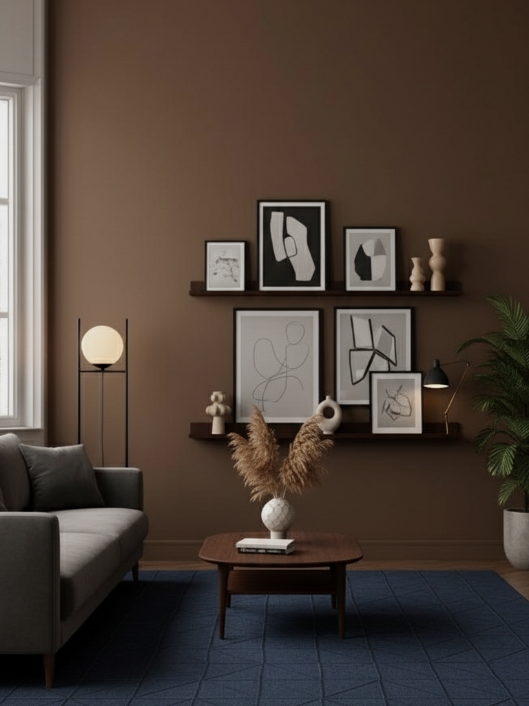
Coffee Bean (Krylon’s color of the year 2026) is a rich, earthy brown reflecting a cultural shift toward grounding and authenticity, like freshly roasted coffee or fertile soil. Use it for accent walls in living rooms, wood trim, cabinetry, or in offices and dens to create an enveloping, cozy atmosphere. I have to say, it pairs beautifully with warm whites, burnt orange, olive green, or natural wood finishes for an organic, layered look.
Choose one color or merge multiple for a unified palette.
- Krylon: Matte Coffee Bean
- Benjamin Moore: ES-67 Oxford Brown
- Sherwin-Williams: SW 6041 Otter
- Behr: PPU5-01 Espresso Beans
- Valspar: 2009-10 Roasted Coffee
- Farrow & Ball: No. 9918 Cola
- Pantone: 20-0031 TPM Coffee Bean Oil
Revere Pewter (hex #ccc6b8)
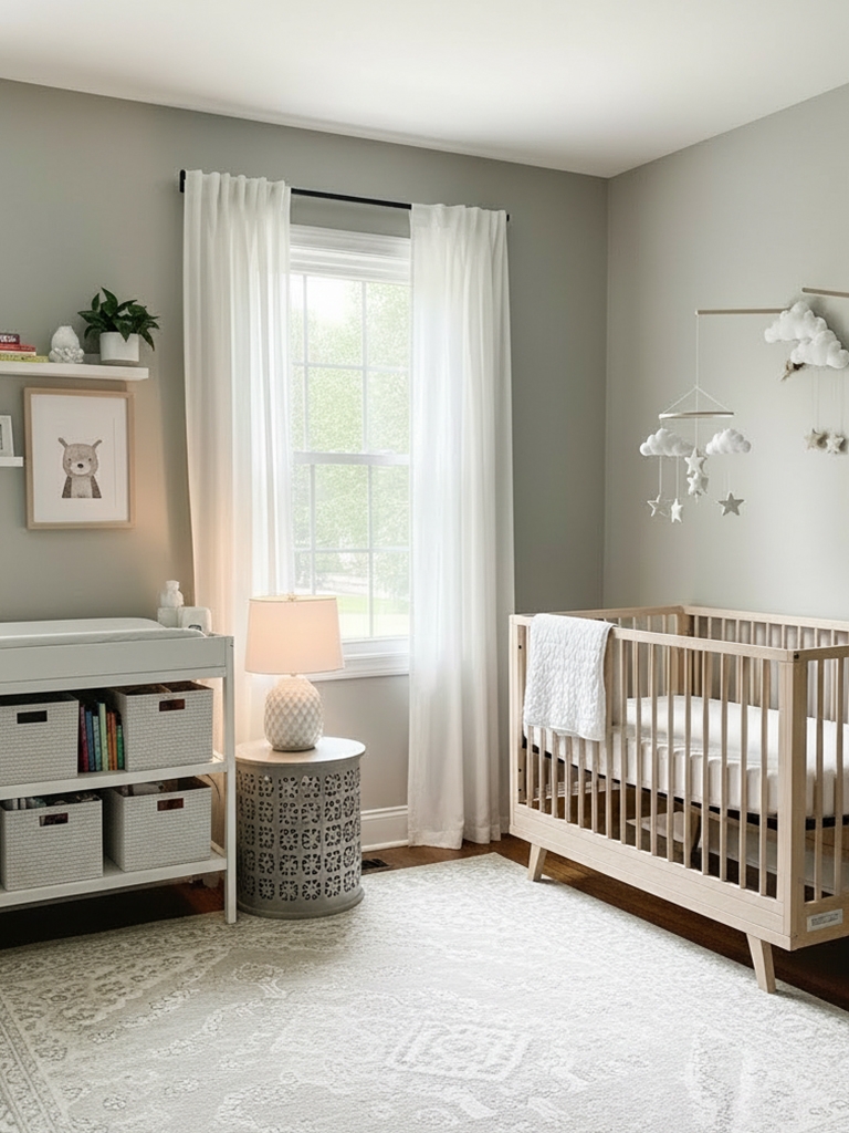
Revere Pewter is a light, warm gray with soft beige undertones, emerging as the new go-to neutral that’s richer than white yet softer than charcoal, like morning mist over stone. I would use it especially in living rooms, bedrooms, and open-concept spaces for its chameleon-like ability to adapt to different lighting. It pairs effortlessly with navy, soft greens, warm woods, or pure white trim for a sophisticated, flexible foundation.
These tones shine individually or harmonize when grouped.
- Benjamin Moore: HC-172 Revere Pewter
- Sherwin-Williams: SW 7036 Accessible Beige
- Behr: N200-2 Toasty Gray
- Valspar: 8004-29A Ghost Story
- Farrow & Ball: No. 241 Skimming Stone
- Pantone: 13-1105 TCX Brown Rice
Silhouette (hex #57504c)
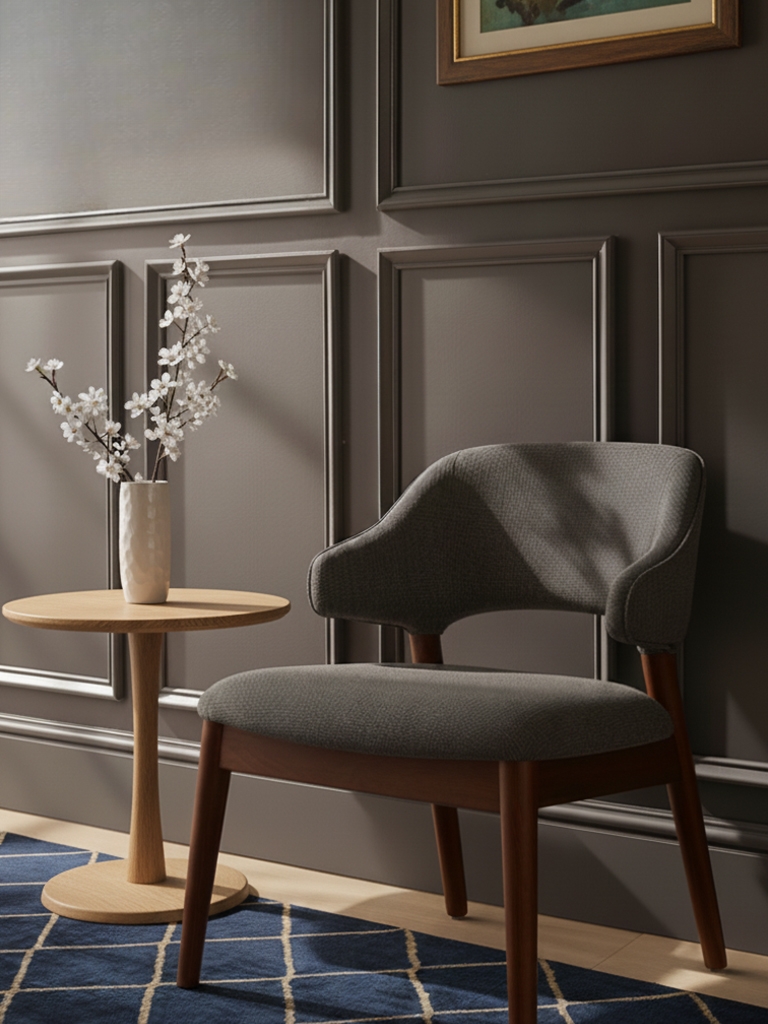
Silhouette (Benjamin Moore’s color of the year 2026) is a luxurious burnt umber with delicate charcoal undertones, creating a color that feels both earthy and refined, like aged leather or fine dark chocolate. Use it in living rooms, dining spaces, or as an accent wall in bedrooms to add warmth and gravitas without feeling overly dark or oppressive. I’ve put it together with warm metallics like copper or bronze, ivory whites, soft sage greens, or any other unsaturated midtones.
Each brand color stands strong on its own or layered with complementary colors.
- Benjamin Moore: AF-655 Silhouette
- Sherwin-Williams: SW 7589 Otter
- Behr: PPU5-01 Espresso Beans
- Valspar: 3009-10 Brown Velvet
- Farrow & Ball: No. 308 Tanner’s Brown
- Pantone: 19-1015 TCX Shaved Chocolate
|
MUST READ: |
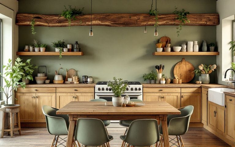
Trending Paint Colors of 2026 by Copilot (copilot.microsoft.com)
Envisioned by Copilot, the next set of colors focuses on atmosphere rather than specific hues. It highlights soothing interior moods, nature-inspired balance, and energizing creative spaces. Together, these themes reflect a desire for environments that feel intentional, emotionally supportive, and expressive. The trends encourage homeowners to shape rooms that promote clarity, comfort, and a renewed sense of connection to their surroundings.
Chocolate Brown (hex #4b2e1e)
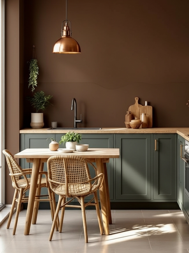
Chocolate Brown is a rich, velvety neutral with deep, earthy undertones that create an immediate sense of warmth and grounded comfort, like aged leather or dark-roasted cocoa. Where do I use it? Whether in living rooms, dining rooms, or bedrooms, aim for a cozy, sophisticated atmosphere that also feels timeless. It blends with soft warm whites, gleaming brass hardware, earthy wood grains, deep olive accents, or neutral beige fabrics for an atmosphere that’s richly luxurious and cozily approachable.
Consider sampling these coordinating brand paint options.
- Sherwin-Williams: SW 9183 Dark Clove
- Benjamin Moore: 2114-10 Bittersweet Chocolate
- Behr: 790B-7 Bitter Chocolate
- Valspar: M257 Dark Chocolate
- Farrow & Ball: No. 55 Wainscot
- Pantone: 19-0912 TCX Chocolate Brown
Glacier Blue (hex #c7dff6)
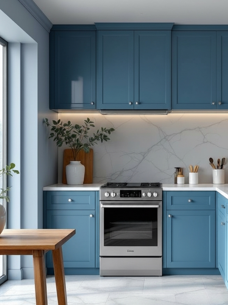
Glacier Blue is a cool, crystalline shade with airy undertones that evoke fresh winter light and open sky. Its clarity brings a refreshing, uplifting energy to interiors without feeling cold or sterile. I use similar colors in bathrooms, kitchens, bedrooms, or bright living spaces where you want a clean, serene backdrop. It pairs with soft grays, chrome fixtures, pale wood, or bright whites for a crisp, modern palette that feels calm and breathable.
You can achieve this vibe with paint colors from comparable brands.
- Sherwin-Williams: SW 6800 Something Blue
- Benjamin Moore: 1653 Glacier Blue
- Behr: 740E-2 Misty Surf
- Valspar: 4006-7A Dewdrop
- Farrow & Ball: No. 314 Sizing
- Pantone: 290 C
Deep Teal (hex #0f4c5c)
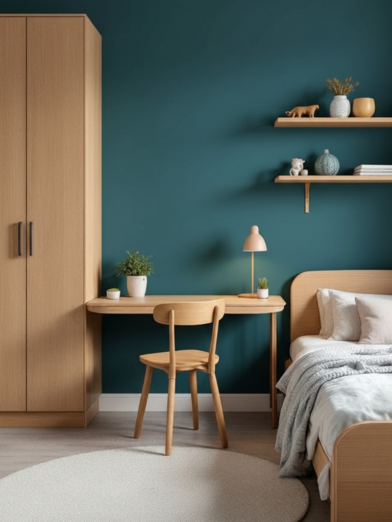
“The best blue-greens feel like they came right from nature, such as moss, eucalyptus, and lichen,” says Lauren Saab, founder of Dallas-based Saab Studios. “They can ground a room, but still feel alive, and pair beautifully with travertine, light oak, and aged brass, which let the color breathe instead of compete.”
Deep Teal is a saturated blue-green with moody, jewel-toned depth that adds instant drama and elegance to any room. Its oceanic richness makes spaces feel layered and expressive. Use it in libraries, dining rooms, accent walls, or cozy dens for a statement color that still feels refined. I balance with rich walnut, gentle metallics, and neutral hues for a modern look.
For a similar look, explore these paint selections:
Rich Gold (hex #c9a44c)
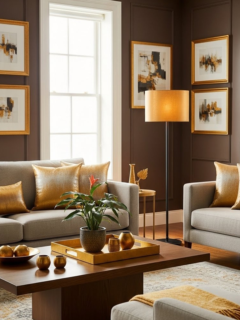
Rich Gold is a warm, brushed metallic-inspired shade with earthy undertones that give it a grounded, sophisticated glow. It adds subtle glamour without overwhelming a space, offering a refined sense of warmth and radiance. Use it as an elegant accent on cabinetry, trim, or feature walls to bring a subtle touch of luxury that feels warm and natural. I pair gold hues with charcoal, navy, deep green, warm neutrals, or black hardware for a palette that feels modern and opulent.
Choose a hero color or build a palette from matching shades.
- Sherwin-Williams: SW 6684 Brittlebush
- Benjamin Moore: 294 Golden Bounty
- Behr: P300-5 Upbeat
- Valspar: 3006-5B Pirate’s Treasure
- Farrow & Ball: No. 66 India Yellow
- Pantone: 16-0947 TCX Bright Gold
Sage Green (hex #b8c1a9)
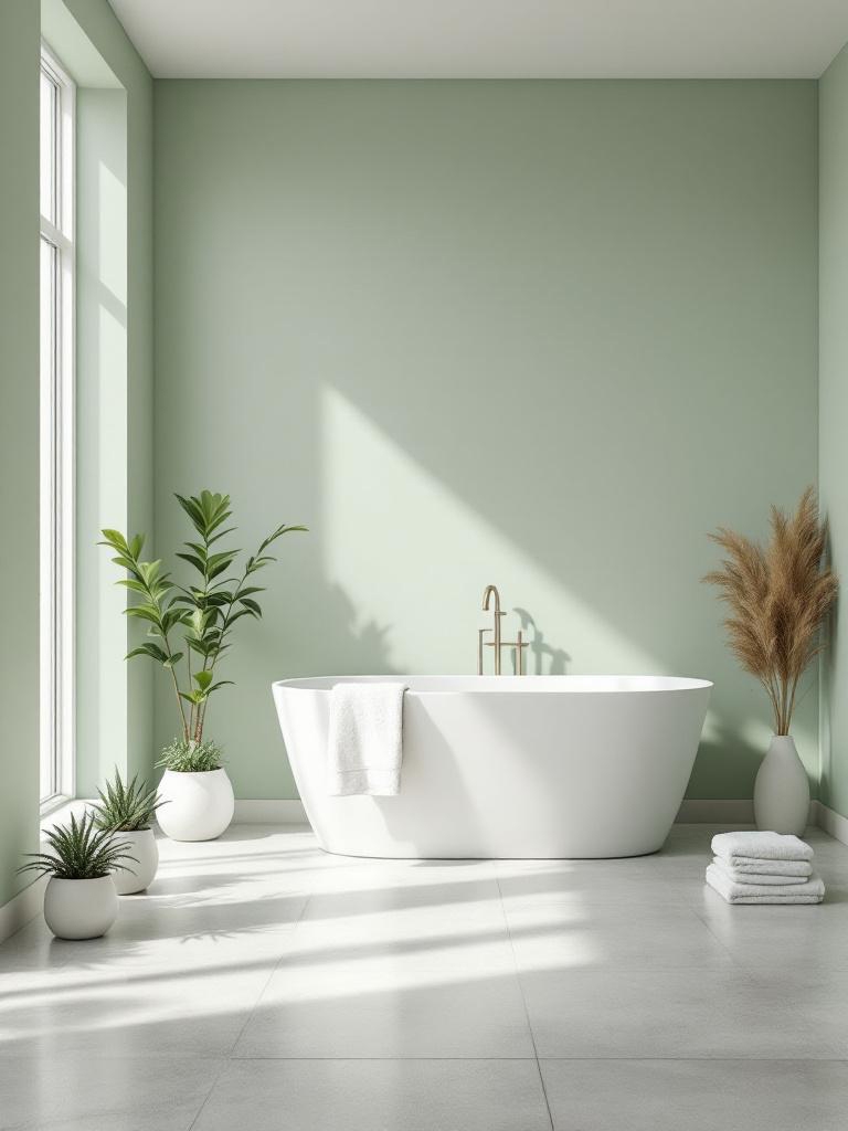
Sage Green is a soft, herbal neutral with muted gray undertones that bring a sense of calm, balance, and natural simplicity to interiors. It feels fresh yet timeless, like sun-washed leaves or soft meadow air. Use it in bedrooms, kitchens, bathrooms, or entryways for a soothing, nature-inspired backdrop. It pairs with warm whites, natural textures, and earthy tones for an organic look.
Select one primary brand color or combine a few aligned tones.
- Sherwin-Williams: SW 9647 Soft Sage
- Benjamin Moore: 458 Sage Tint
- Behr: ICC-77 Sage Green
- Valspar: V098-2 Cottage Charm
- Farrow & Ball: No. 234 Vert de Terre
- Pantone: 15-0318 TCX Sage Green
Ivory (hex #f4efe6)
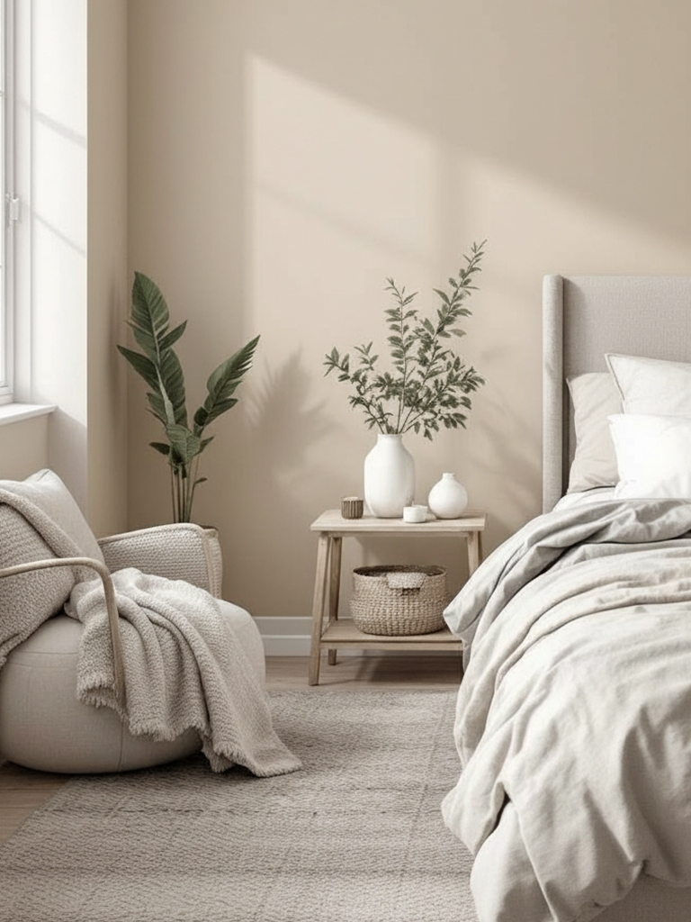
Ivory is a warm, pillowy white with soft creamy undertones that create a gentle, inviting glow in any room. It brightens spaces without the starkness of pure white, offering a cozy, breathable sense of openness. Use it as a whole-home neutral in living rooms, hallways, and bedrooms. I paint it where I want light, warmth, and softness. It pairs seamlessly with warm woods, muted greens, soft grays, or black accents for a clean yet comforting palette.
Anchor your look with one color or blend several that complement each other.
- Sherwin-Williams: SW 7102 White Flour
- Benjamin Moore: 925 Ivory White
- Behr: PPU7-15 Ivory Lace
- Valspar: 8007-4A Ivory Keys
- Farrow & Ball: No. 239 Wimborne White
- Pantone: 11-0610 TSX Silence
Burgundy (hex #5a1a1a)
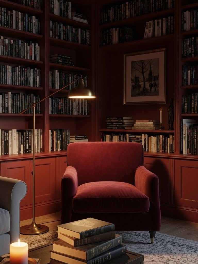
Burgundy is a deep, wine-rich red with moody undertones that add instant sophistication and warmth to any room. It creates a dramatic yet comforting atmosphere, reminiscent of vintage libraries and candlelit dining spaces. I like to use it in dining rooms, studies, or accent walls to add a touch of depth and elegance, creating a beautiful atmosphere without making the space feel crowded. Use it in combinations with gold accents, warm neutrals, dark wood, or soft lighting for a refined, intimate palette.
Pick one dominant color or pair multiple complementary shades.
- Sherwin-Williams: SW 6300 Burgundy
- Benjamin Moore: 1280 Burgundy Rose
- Behr: M140-7 Dark Crimson
- Valspar: 1011-6 Ancient Burgundy
- Farrow & Ball: No. 43 Eating Room Red
- Pantone: 19-1617 TPG Burgundy
Classic Khaki (hex #c3b59b)
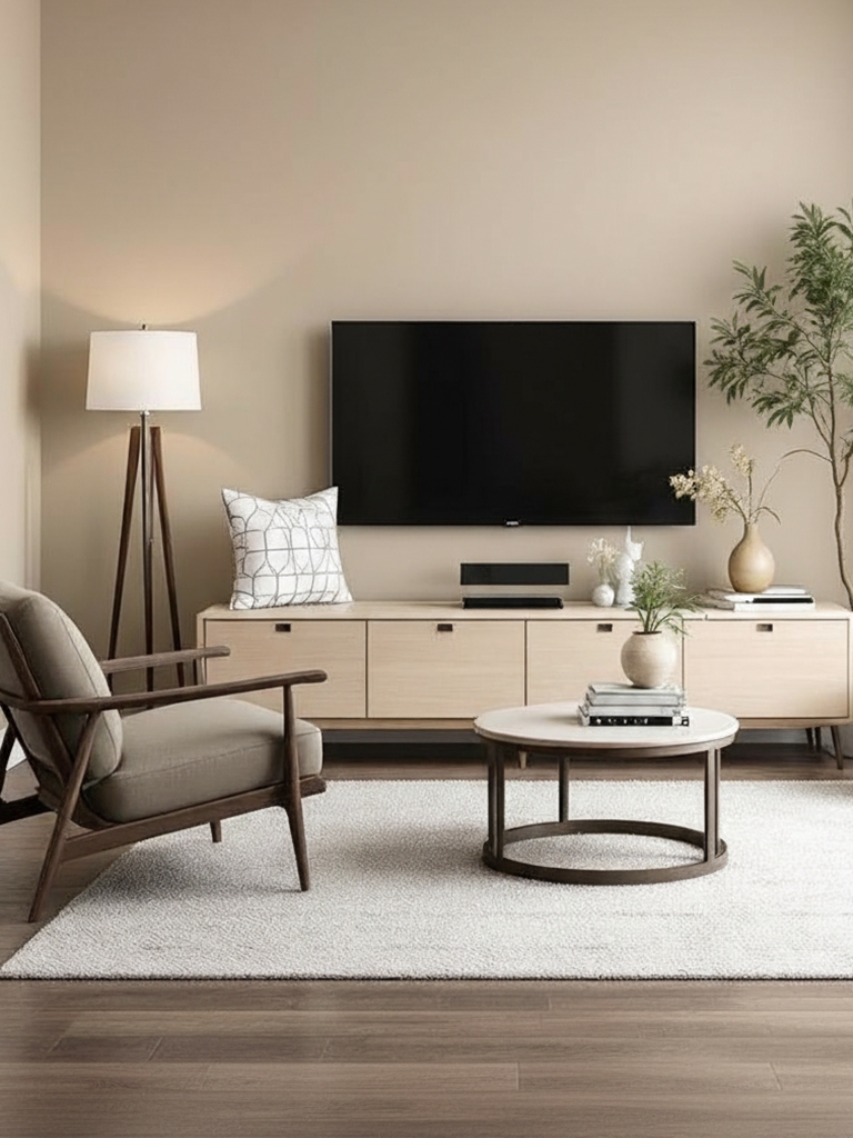
Classic Khaki is a sandy, timeless neutral with warm beige undertones that bring subtle structure and natural ease to interiors. It feels grounded and versatile, like sun-bleached stone or woven linen. Use it in living rooms, hallways, or multipurpose spaces where you want a dependable neutral that works with both bold and understated accents. I sure pair it with navy, olive, rust, charcoal, or crisp white trim for a balanced, enduring palette.
Stick to a single brand hue or mix compatible colors for depth.
- Sherwin-Williams: SW 9612 Perfect Khaki
- Benjamin Moore: 2148-40 Light Khaki
- Behr: HDC-NT-09 Basic Khaki
- Valspar: 8004-18B Classic Khaki
- Farrow & Ball: No. 9 Light Stone
- Pantone: PANTONE 7535-C
Black (hex #1a1a1a)
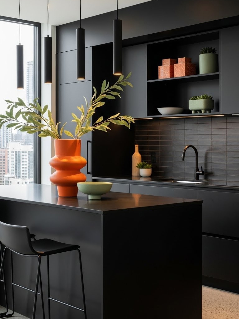
Black (or Eerie Black) is a bold, architectural neutral with inky depth that adds instant modernity and structure to interiors. Its dramatic presence anchors a room, highlighting textures, shapes, and materials with striking clarity. Go bold on accent walls, cabinetry, doors, or contemporary kitchens where you want strong contrast and visual impact. I love how it unites warm woods, metallic touches, and soft textures in a confident palette.
Use one main brand color or create interest with a subtle mix.
- Sherwin-Williams: W 6258 Tricorn Black
- Benjamin Moore: 2132-10 Black
- Behr: Black
- Valspar: V120-3 Black Heron
- Farrow & No. G18 Smelt Black
- Pantone: 19-3911 TCX Black Beauty
|
MUST READ: |
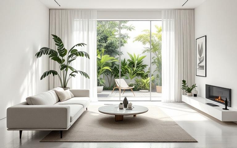
Trending Paint Colors of 2026 by Gemini (gemini.google.com)
Gemini’s 2026 palette marks a departure from stark minimalism, favoring emotional depth and organic warmth. These tones embody an exquisite sense of “grounded luxury“, creating an inviting and sophisticated atmosphere. It is a refined, tactile collection designed to make spaces feel curated, intimate, and deeply connected to the natural world.
Silhouette (hex #57504c)
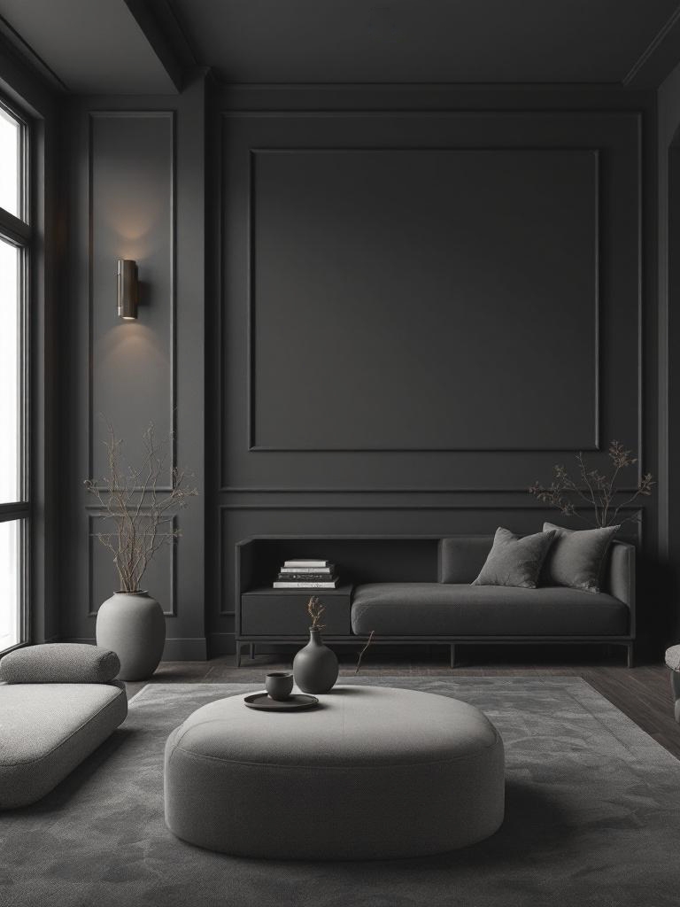
Silhouette is a sultry espresso-charcoal with hidden violet undertones, evoking the mystery of twilight and high-end architectural design. Use it for color drenching in media rooms, primary suites, or home offices to achieve a dramatic, cocoon-like atmosphere. I love pairing it with brushed brass, lush velvet textures, or sleek alabaster trim to create a warm and inviting atmosphere.
The paint colors from similar brands can be freely mixed with other shades.
- Benjamin Moore: AF-655 Silhouette (Color of the Year 2026)
- Sherwin-Williams: SW 7589 Otter
- Behr: PPU5-01 Espresso Beans
- Valspar: 3009-10 Brown Velvet
- Farrow & Ball: No. 308 Tanner’s Brown
- Pantone: 19-1015 TCX Shaved Chocolate
Hidden Gem (hex #596d69)
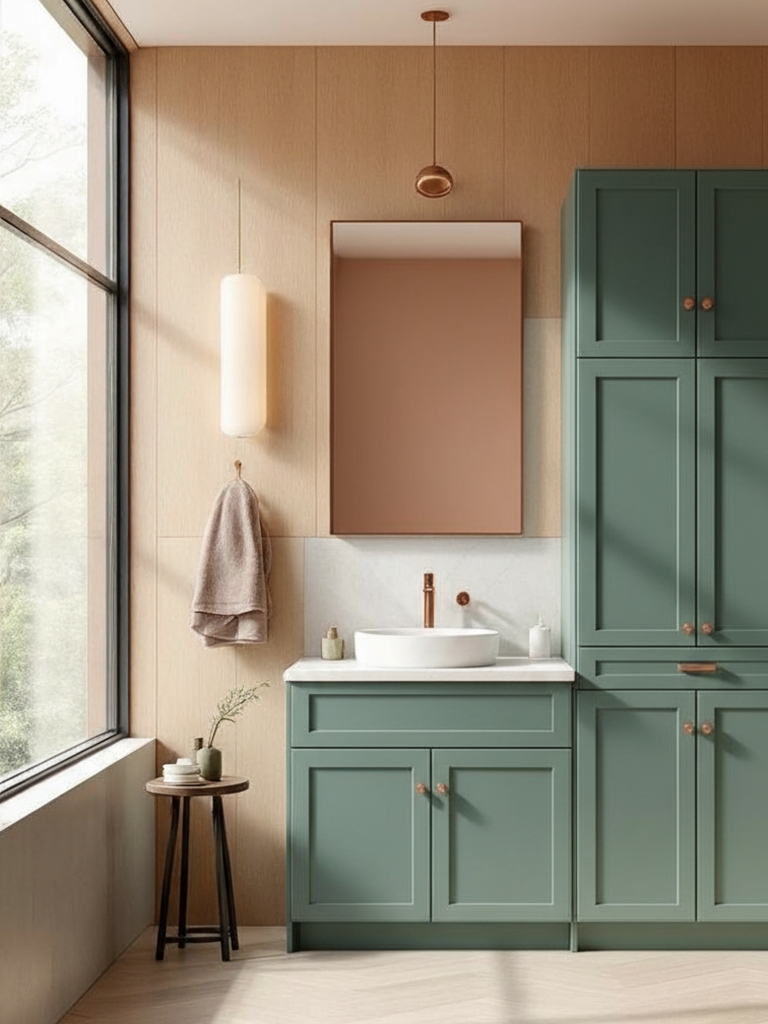
“If there’s one paint color that has dominated interiors over the past few years it’s green. Warm, nature-inspired tones bring a cozy, grounded feel to any space, and have been used so widely in interiors that many are calling green the new neutral.” – Cori Sears, home decor writer at The Spruce
Hidden Gem is a saturated, smoky jade with deep teal leanings, evoking the lush tranquility of a secluded rainforest. This jewel tone is ideal for kitchen islands, cabinetry, or powder rooms where you want to make a bold yet serene statement. It uses it in combination with warm oak, copper accents, or soft peach tones.
Go minimal with one color or layer in complementary tones.
Warm Eucalyptus (hex #7c7f70)
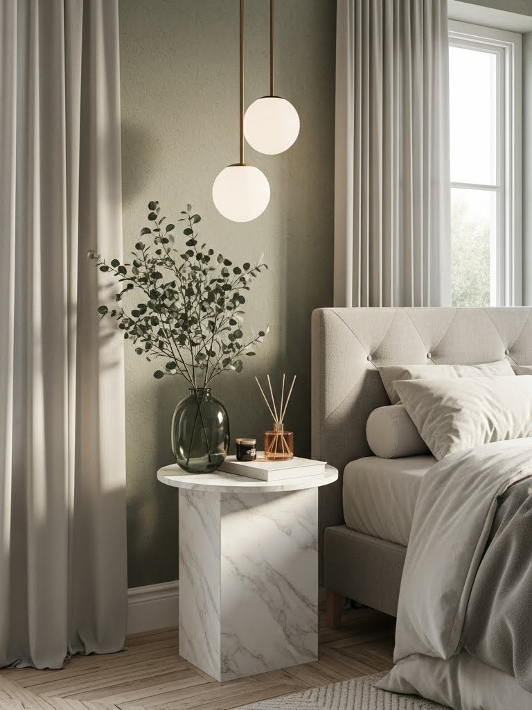
Warm Eucalyptus is a muted, silvery sage with a hint of sun-drenched warmth, evoking the refreshing scent of a spa or a hazy morning garden. This restorative green works perfectly in bedrooms or bathrooms to promote a sense of wellness and clarity. It pairs beautifully with light-toned woods, white marble, terracotta, or other soft, elegant materials, creating a warm and inviting atmosphere.
These comparable paint colors pair easily with any color scheme.
- Valspar: 8004-28F Warm Eucalyptus (Color of the Year 2026)
- Sherwin-Williams: SW 6166 Eclipse
- Benjamin Moore: 2141-30 Army Green
- Behr: N390-5 Eucalyptus Wreath
- Farrow & Ball: No. 292 Treron
- Pantone: 15-0513 TPG Eucalyptus
Universal Khaki (hex #b8a992)
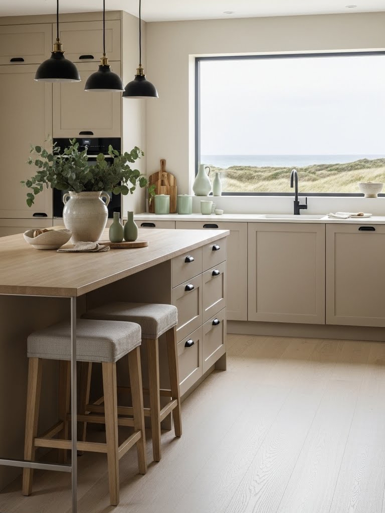
Universal Khaki is a soft, sandy neutral with a balanced blend of gray and beige undertones, evoking the quiet calm of a coastal landscape. This neutral provides a versatile backdrop for living rooms, entryways, and open-plan kitchens, offering a grounded, organic feel. In my opinion, combine this hue with materials such as natural linen, matte-black hardware, soft sage-green, or lime cream home decor products.
Choose a signature shade or blend with supportive, coordinating colors.
- Sherwin-Williams: SW 6150 Universal Khaki
- Benjamin Moore: HC-114 Greenbrier Beige
- Behr: N310-4 Desert Khaki
- Valspar: 8004-18B Classic Khaki
- Farrow & Ball: No. 223 London Stone
- Pantone: 15-1214 TCX Tan
Warm Mahogany (hex #764034)
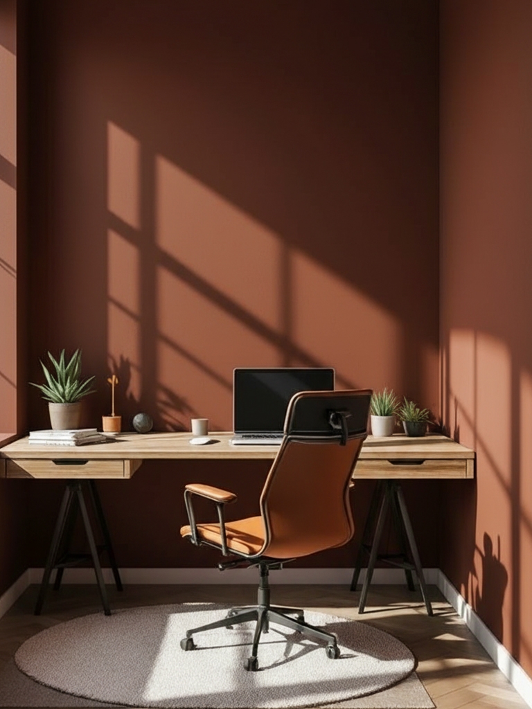
Warm Mahogany is a rich, deep reddish-brown with warm undertones, evoking luxury and timeless elegance, like fine wood furniture. Feel free to use it thoughtfully in your home decor – great for accent walls, dining areas, libraries, or bedrooms to add a warm, sophisticated touch. It wonderfully pairs with colors like creams, golds, or greens.
Focus on one brand color or combine several for a cohesive palette.
- Glidden: PPG1060-7 Warm Mahogany (Color of the Year 2026)
- Sherwin-Williams: SW 2838 Polished Mahogany
- Benjamin Moore: HC-64 Townsend Harbor Brown
- Behr: 170-7 Dark Cherry Mocha
- Valspar: 2002-9A Tavern Mahogany
- Farrow & Ball: No. W101 Deep Reddish Brown
- Pantone: 18-1425 TPG Mahogany
Melodious Ivory (hex #e4caad)
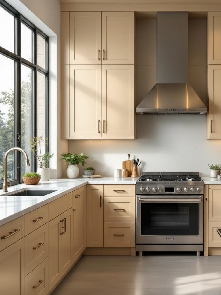
“With its 2026 Color of the Year, Dutch Boy Paints proves that neutrals don’t have to be boring. Melodious Ivory is soft and warm, pairing beautifully with bold layers and timeworn wood, while other brands emphasize serene green tones and rich reds.” – Alyssa Gautieri, home decor writer at Good Housekeeping
Melodious Ivory is a soft, creamy neutral with warm yellowish-peach undertones, evoking a sense of nostalgia and intentional living. This versatile “new neutral” is perfect for sun-drenched kitchens, cozy bedrooms, or open-concept living areas where you want to create a welcoming, balanced atmosphere. It serves as an elegant, understated backdrop that beautifully highlights natural wood textures, handcrafted decor, and personal heirlooms.
Build your palette around one brand color or a coordinated mix.
Divine Damson (hex #431e22)
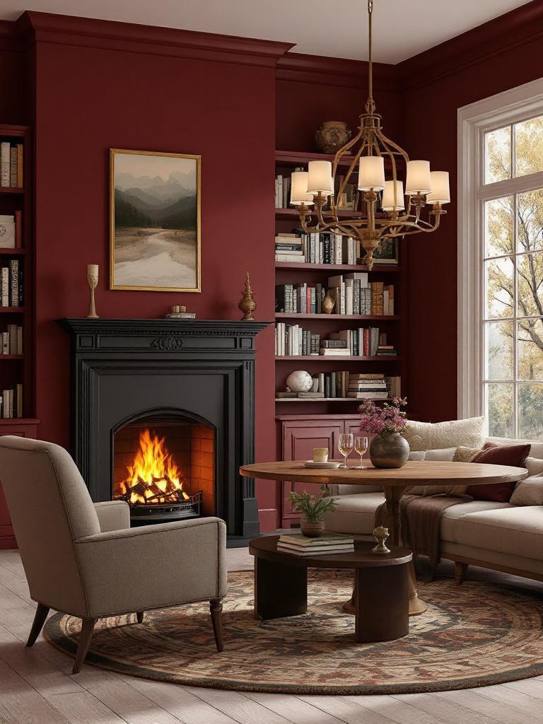
Divine Damson is a velvety, blackened plum with deep violet undertones, evoking the luxury of heritage estates and ripe autumn fruit. Perfect for formal dining rooms or cozy reading corners, it adds a layer of soulful, moody elegance. I love pairing this with antiqued silver, dusty lavender, or charcoal grays – it truly creates a beautiful and inviting combination.
You can use these shades from similar brands on their own or mix them with other colors for a unique look.
- Graham & Brown: Divine Damson (Color of the Year 2026)
- Benjamin Moore: 2075-10 Elderberry Wine
- Sherwin-Williams: SW 6565 Fabulous Grape
- Behr: S-H-680 Purple Bloom
- Valspar: 1011-6 Ancient Burgundy
- Farrow & Ball: No. 297 Preference Red
- Pantone: 19-2118 TCX Winetasting
Epernay (hex #decea4)
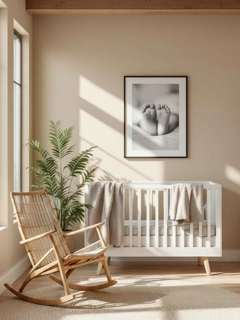
Epernay is a sophisticated, sun-drenched ochre with buttery undertones, evoking the golden glow of a vintage vineyard at dusk. This radiant neutral brings an approachable warmth to kitchens, sunrooms, nurseries, or hallways, offering a more colorful alternative to beige. I shall test it exquisitely with creamy whites, terracotta accents, or deep navy blues for a classic, high-contrast look.
Lead with a single color or expand into a complementary range.
- C2 Paint: C2-639 Epernay (Color of the Year 2026)
- Benjamin Moore: 2152-50 Golden Straw
- Sherwin-Williams: SW 6379 Jersey Cream
- Behr: P330-2 LIME BRIGHT
- Valspar: R119C Consommé
- Farrow & Ball: No. 52 Straw
- Pantone: 12-0830 TSX Pancake Batter
Forest Canopy (hex #3b4d3b)
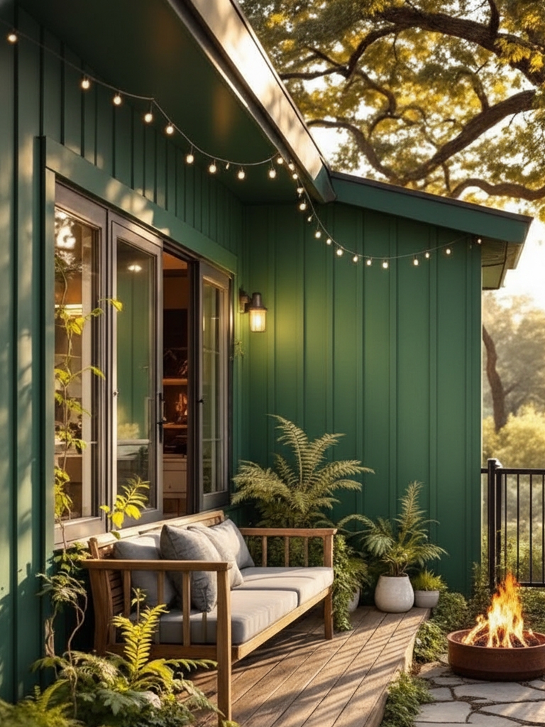
Forest Canopy is a moody, deep velvet green with cool charcoal undertones, evoking the dense, mysterious shadows of an ancient woodland. This dramatic shade is perfect for “color drenching” home offices, media rooms, or cabinetry to create a snug, high-end sanctuary. Not to mention outdoor! For me, it serves as a stunning anchor when styled with brass hardware, marble surfaces, or cognac leather.
Define your look using one hue or a thoughtfully paired set.
- Sherwin-Williams:SW 6447 Evergreens
- Benjamin Moore: CSP-810 Chimichurri
- Behr: MQ6-49 Chard
- Valspar: 6009-5 Wilderness
- Farrow & Ball: No. W55 Duck Green
- Pantone: 19-6110 TCX Deep Forest
|
MUST READ: |
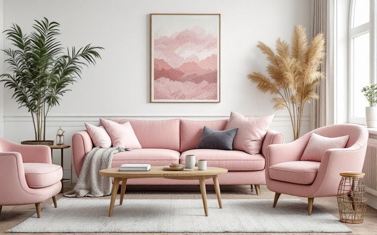
Trending Paint Colors of 2026 by Grok (grok.com)
Grok’s 2026 trending paint colors reflect a cultural shift toward restorative, nature-connected interiors that prioritize emotional well-being in an overstimulated world. These warm, earthy palettes foster a sense of grounded serenity and timeless comfort. Ultimately, this collection embodies quiet luxury: cozy yet refined, organic yet polished, promoting calm, connection, and lasting harmony in the home.
Smoky Jade (hex #5a7a75)
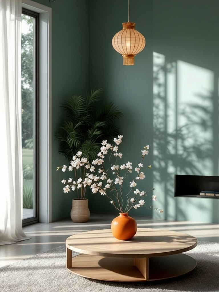
Smoky Jade, a muted blue-green jade similar to Hidden Gem from Behr, delivers tranquil depth with subtle intrigue. I adore its sophisticated take on natural hues. Ideal as accents in living spaces, kitchens, studies, or bathrooms for an inviting, elegant ambiance. It complements woods, silvers, or deeper greens beautifully.
Define your look using one hue or a thoughtfully paired set.
- Behr: N430-6A Hidden Gem (Color of the Year 2026)
- Sherwin-Williams: SW 6207 Retreat
- Benjamin Moore: 686 Crisp Romaine
- Valspar: 5004-4B Blueridge Fir
- Farrow & Ball: No. 84 Green Blue
- Pantone: 18-5612 TCX Sagebrush Green
Olive Grove (hex #857c5d)
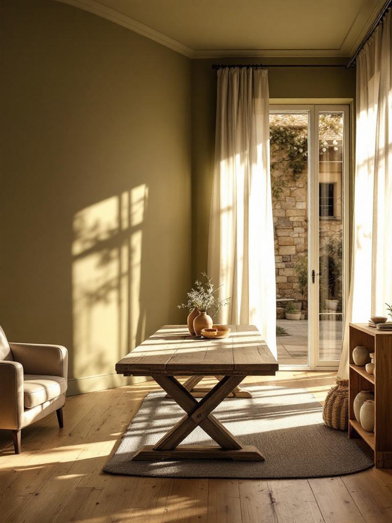
Olive Grove, a rich, muted olive, evokes ancient groves with grounded sophistication. I appreciate its versatile warmth in modern schemes. Use for feature walls in dining areas, hallways, cabinets, or exteriors to create a cozy heritage feel. Blends seamlessly with creams, woods, or golds.
Define your look using one hue or a thoughtfully paired set.
- Sherwin-Williams: SW 7734 Olive Grove
- Benjamin Moore: 517 Greenbrook
- Behr: N340-7 KILIMANJARO
- Valspar: 6005-4B Ripe Olive
- Farrow & Ball: No. 312 Dibber
- Pantone: 18-0614 TSX Mountain Pass
Warm Eucalyptus (hex #7b8473)
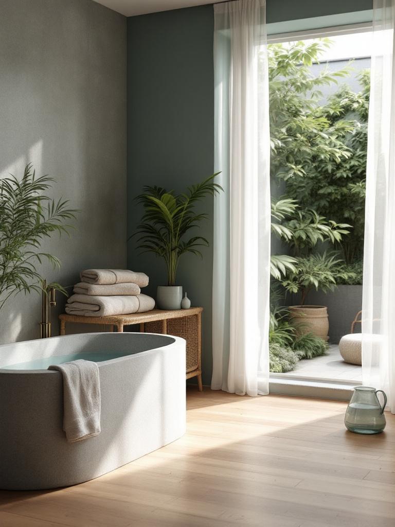
Warm Eucalyptus, a soft gray-green eucalyptus, offers soothing warmth and earthy balance. I love how it refreshes organic palettes. Perfect for bedrooms, home offices, entryways, or spas to foster mindful relaxation. Why go neutral when this whispers wellness? Pairs wonderfully with beiges, terracottas, or soft blues.
Start with a core brand color or blend in matching tones.
- Valspar: 8004-28F Warm Eucalyptus (Color of the Year 2026)
- Sherwin-Williams: SW 6166 Eclipse
- Benjamin Moore: 2141-30 Army Green
- Behr: N390-5 Eucalyptus Wreath
- Farrow & Ball: No. 292 Treron
- Pantone: 15-0513 TPG Eucalyptus
Terracotta Clay (hex #d08f74)
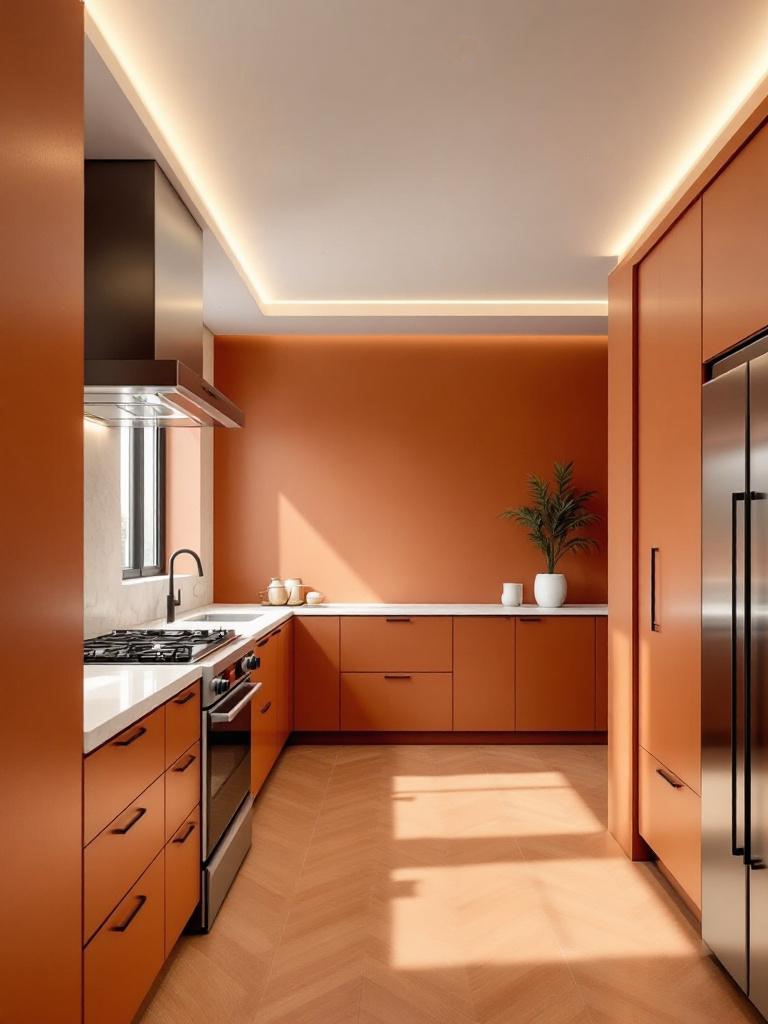
Terracotta Clay, a vibrant yet muted terracotta, brings sun-baked earthiness and vitality. I enjoy its lively update to rustic tones. Great for kitchen accents, outdoor, sunrooms, powder rooms, or furniture to infuse a welcoming energy. Why pick cold when this glows with life? Pairs stunningly with whites, greens, or brass.
Highlight one key color or balance it with complementary accents.
- Sherwin-Williams: SW 7701 Cavern Clay
- Benjamin Moore: 2093-30 Potters Clay
- Behr: M200-5 Terracotta Clay
- Valspar: 2009-4 Roasted Pepper
- Farrow & Ball: No. 315 Naperon
- Pantone: 17-1545 TCX Terracotta
Cloud Dancer (hex #f0eee9)
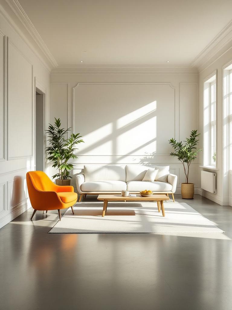
Cloud Dancer (Pantone’s color of the year for 2026) is a soft off-white that blends subtle warmth with airy lightness, creating peaceful serenity and quiet elegance. I love how it refreshes neutral tones. I will be using it throughout the home decor (on walls, trim, ceilings, and furniture) to add a bright, sophisticated sense of openness. It really helps make the space feel warm and inviting. Why settle for plain when this radiates timeless calm? It pairs beautifully with earth tones, pastels, or broad accents.
Pick one signature shade, or curate a small palette of colors that naturally work together.
- Sherwin-Williams: SW 7008 Alabaster
- Benjamin Moore: OC-65 Chantilly Lace
- Behr: 73 White Veil
- Valspar: 7006-24 Swiss Coffee
- Farrow & Ball: No. 2005 All White
- Pantone: 11-4201 Cloud Dancer
Silhouette (hex #57504c)
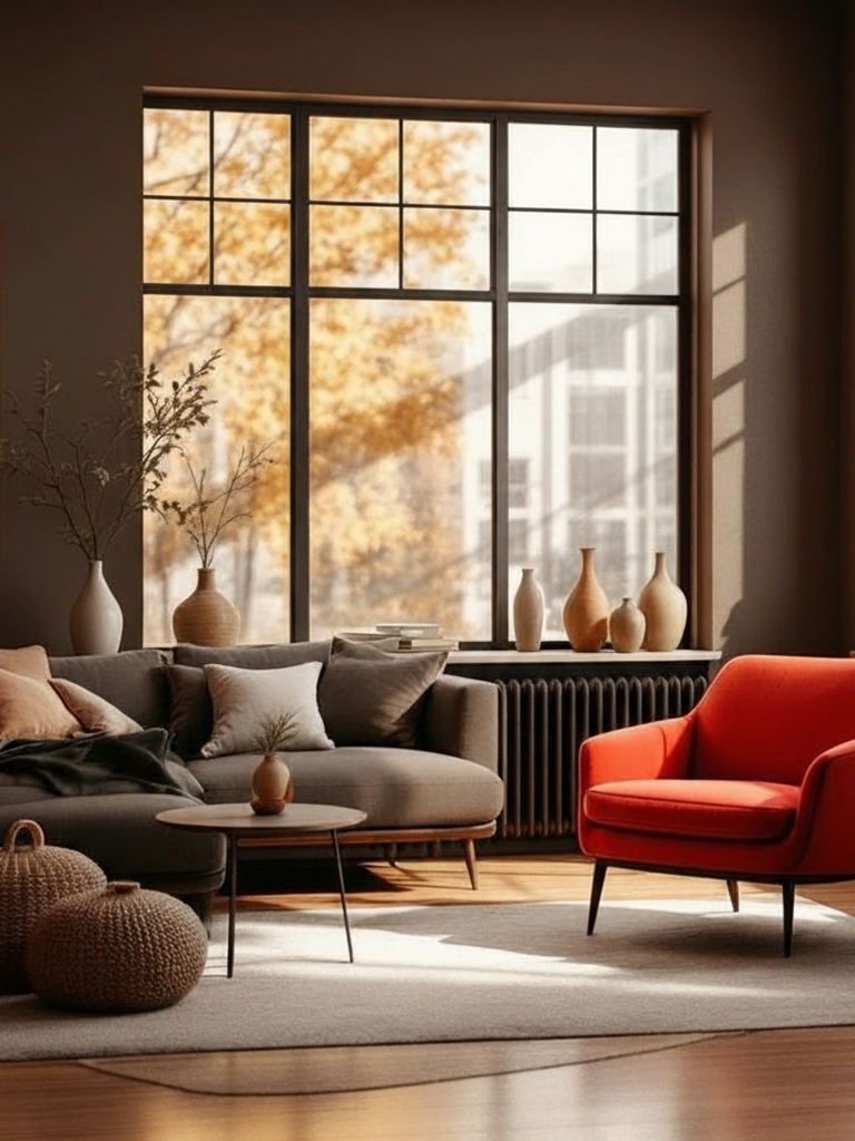
Silhouette, a deep smoky brown, fuses burnt umber with hints of charcoal for enveloping warmth and subtle drama. I cherish how it elevates earthy palettes to luxurious heights. Use sparingly in home decor for accent walls, studies, media rooms, or bedrooms to create an intimate, refined cocooning. It pairs elegantly with creamy whites, gentle taupes, or warm metallics.
- Benjamin Moore: AF-655 Silhouette (Color of the Year 2026)
- Sherwin-Williams: SW 7589 Otter
- Behr: PPU5-01 Espresso Beans
- Valspar: 3009-10 Brown Velvet
- Farrow & Ball: No. 308 Tanner’s Brown
- Pantone: 19-1015 TCX Shaved Chocolate
Melodious Ivory (hex #e4caad)
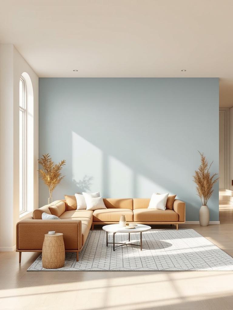
Melodious Ivory, a gentle, warm ivory, evokes creamy softness and timeless comfort. I cherish its elevated neutral glow. Wonderful throughout homes, ceilings, trim, or as a canvas for layered warmth. Why stark white when this sings subtle luxury? Blends dreamily with earth tones, textures, or accents.
Shape your palette with one color or a unified blend.
- Dutch Boy: Melodious Ivory (Color of the Year 2026)
- Benjamin Moore: OC-2 Pale Almond
- Sherwin-Williams: SW 7012 Creamy
- Behr: MQ3-43 CERAMIC BEIGE
- Valspar: 3007-6B Homey Cream
- Farrow & Ball: No. 203 Tallow
- Pantone: 11-4101 TCX Stalactite
Divine Damson (hex #431e22)
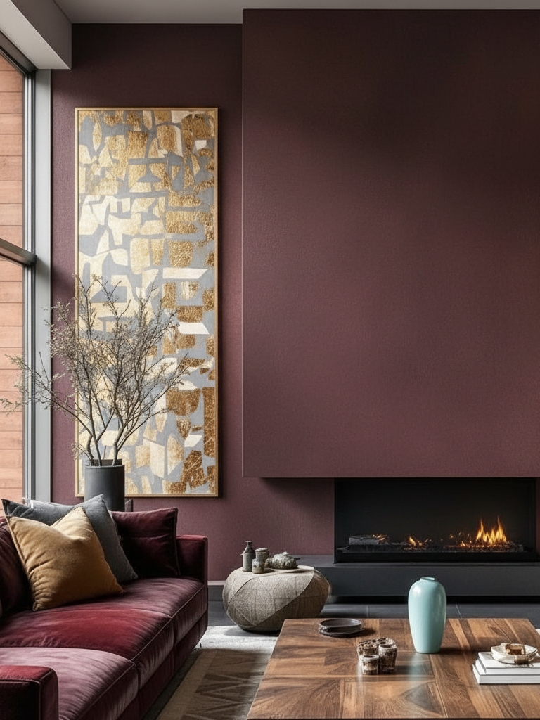
As Paula Taylor, Graham & Brown’s senior stylist and trend specialist explains, “Divine Damson works well as a standalone color as it’s such a vivid and rich color. You can also soften its intensity with grounding neutrals. When combined with muted shades like pastels or warm neutrals, it levels out the bold color by adding warmth and balance. Soft greys will balance the intensity and keep a modern look, whereas earthy neutral tones will complement the richness beautifully.“
Divine Damson, a lush, deep plum, blends rich cherry-violet for luxurious serenity with bold allure. I value how it elevates moody palettes to regal heights. Use sparingly in home decor for accent walls, dining rooms, bedrooms, libraries, or cabinets to create enveloping, sophisticated intimacy.
Universal Khaki (hex #b8a992)
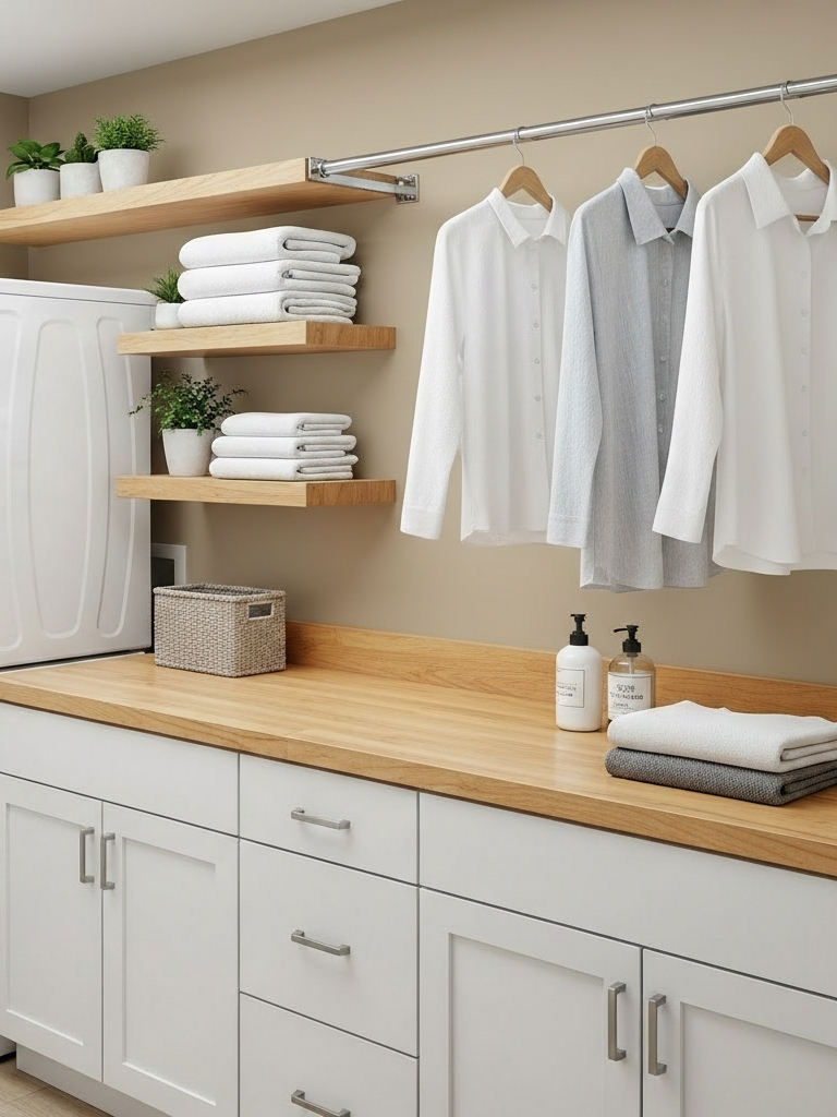
Universal Khaki, a warm mid-tone khaki, provides effortless neutral grounding with a subtle green undertone. I value its adaptable elegance across styles. Suited for whole rooms, exteriors, trim, or bases to achieve a balanced sense of serenity. Why limit options when this unites everything? Pairs ideally with whites, woods, or bolder tones.
Feature a single brand hue or build a cohesive color mix.
- Sherwin-Williams: SW 6150 Universal Khaki
- Benjamin Moore: HC-114 Greenbrier Beige
- Behr: N310-4 Desert Khaki
- Valspar: 8004-18B Classic Khaki
- Farrow & Ball: No. 223 London Stone
- Pantone: 15-1214 TCX Tan
|
MUST READ: |
Trending Paint Colors of 2026 by Perplexity (perplexity.ai)
Perplexity’s synthesis of these tones feels well-balanced and polished, combining a sense of comfort with sophistication. They lean contemplative and cocooning, with subtle drama from deeper notes and gentle uplift from lighter ones. Atmospherically, they suggest quiet luxury, introspection, and stability rather than high-energy vibrancy, supporting layered, mature spaces that feel both intimate and quietly confident.
Silhouette (hex #57504c)
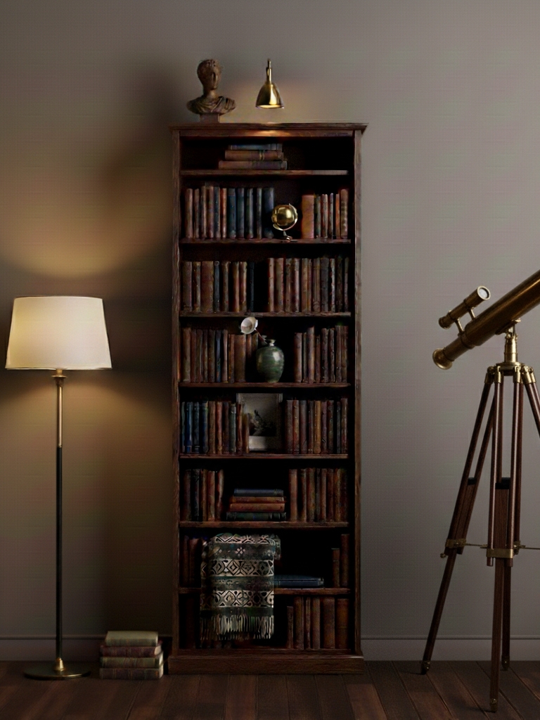
Silhouette, a refined deep charcoal-plum, merges inky depth with subtle warmth for moody elegance and tailored calm. I value how it feels intimate rather than austere, adding quiet drama without heaviness. Use thoughtfully in home decor for libraries, bedrooms, dining rooms, or accent walls to create a grounded, enveloping sophistication. It pairs beautifully with stone, brushed metals, warm woods, and curated art.
Ground the design in one color or expand with coordinating hues.
- Benjamin Moore: AF-655 Silhouette (Color of the Year 2026)
- Sherwin-Williams: SW 7589 Otter
- Behr: PPU5-01 Espresso Beans
- Valspar: 3009-10 Brown Velvet
- Farrow & Ball: No. 308 Tanner’s Brown
- Pantone: 19-1015 TCX Shaved Chocolate
Cloud Dancer (hex #f0eee9)
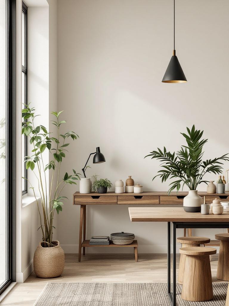
Cloud Dancer (Pantone’s color of the year 2026) drifts in as a gossamer-soft neutral that reads luminous rather than clinical. I admire how it buoyantly rescues dim interiors, lending visual altitude without draining warmth or personality. Apply it where restraint matters: living rooms, studios, hallways, or open-plan spaces to achieve a gallery-clear calm that still feels lived-in. It harmonizes effortlessly with natural timber, honed stone, brushed brass, and muted mineral textures.
Use one focal shade or mix aligned colors for depth.
- Sherwin-Williams: SW 7008 Alabaster
- Benjamin Moore: OC-65 Chantilly Lace
- Behr: 73 White Veil
- Valspar: 7006-24 Swiss Coffee
- Farrow & Ball: No. 2005 All White
- Pantone: 11-4201 Cloud Dancer
Adventurer (hex #5D3A40)
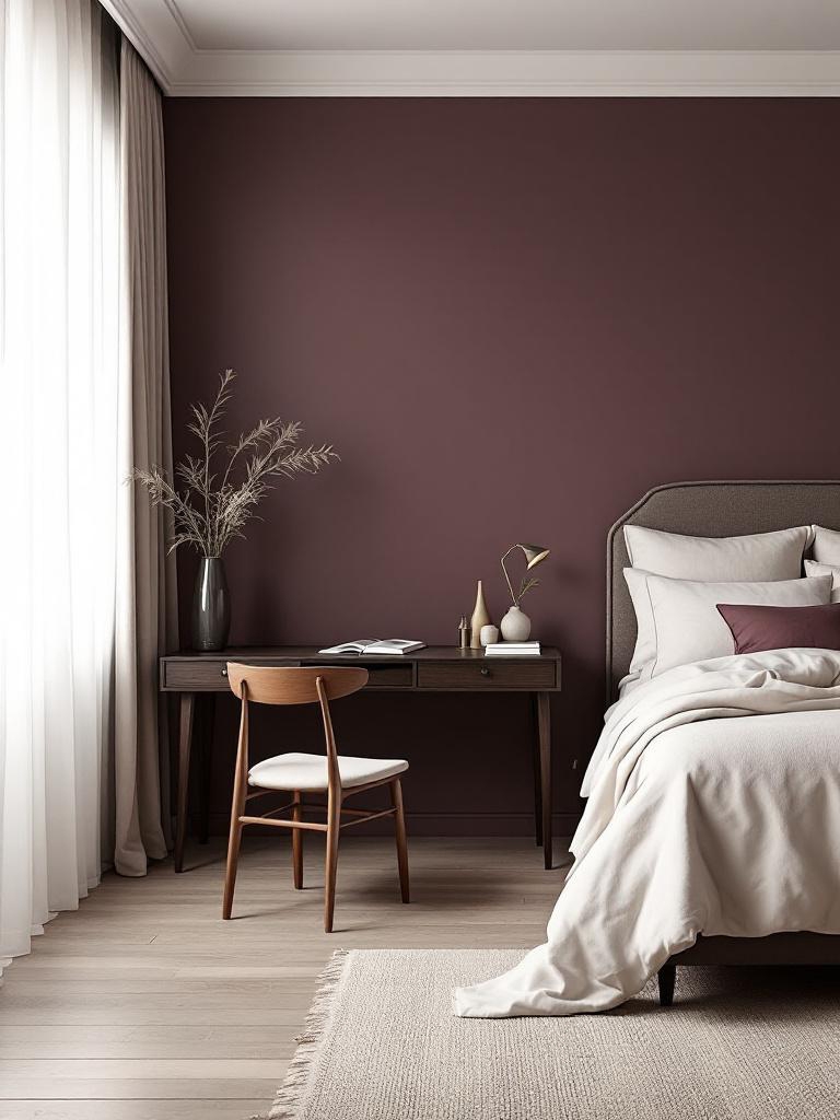
Regal yet reassuring, Adventurer is a timeless plum-aubergine paint shade that brings depth and quiet confidence to a space. Use it on bedroom walls, headboards, or feature alcoves to create an intimate, cocooning atmosphere. Balance its richness with soft neutrals, warm off-whites, or pale blush pink accents for a refined, harmonious home décor palette.
Choose one standout tone or blend several for balance.
- Little Greene Paint: Adventurer
- Sherwin-Williams: SW 6276 Morristown Red
- Benjamin Moore: AF-630 Caponata
- Behr: PPU1-12 Plum Brown
- Valspar: 1011-9 Merlot
- Farrow & Ball: No. 295 Paean Black
- Pantone: 19-1627 TCX Port Royale
Hidden Gem (hex #596d69)
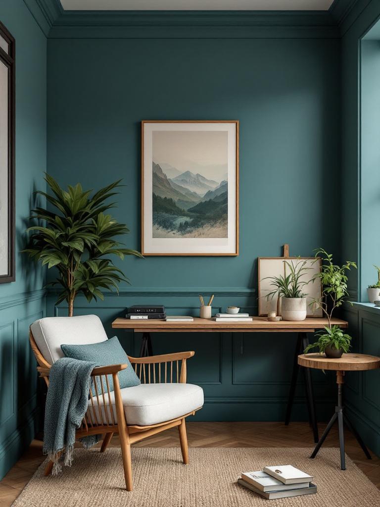
Hidden Gem brings atmospheric calm with an undercurrent of adventure, feeling like a collected, well-traveled accent rather than a shouty statement. Its blue-green nuance shifts beautifully across the day, adding movement and intrigue. Use it on cabinetry, feature walls, or small rooms where a cocoon of character and depth is welcome.
Let one color lead or support it with complementary layers.
- Behr: N430-6A Hidden Gem (Color of the Year 2026)
- Sherwin-Williams: SW 6207 Retreat
- Benjamin Moore: 686 Crisp Romaine
- Valspar: 5004-4B Blueridge Fir
- Farrow & Ball: No. 84 Green Blue
- Pantone: 18-5612 TCX Sagebrush Green
Universal Khaki (hex #b8a992)
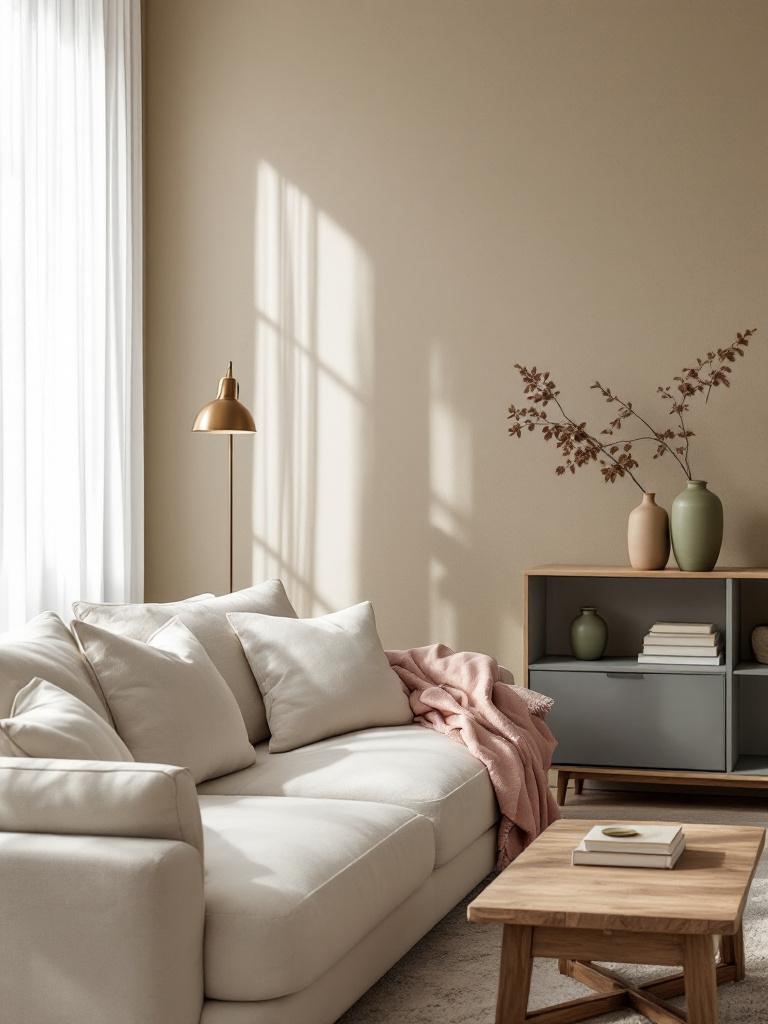
Universal Khaki, an unhurried chameleon of a neutral, hovers deftly between greige restraint and timeworn tan, delivering a backdrop that rarely missteps. I value how it edits visual noise, coaxing mismatched furnishings into a composed conversation instead of a design argument. Apply it where calm continuity matters: corridors, family gathering spaces, or expansive open plans. It complements warm whites, soft woods, muted metals, earthy greens, dusty pinks, and charcoal accents beautifully.
Center your palette on one brand shade or a blended spectrum.
- Sherwin-Williams: SW 6150 Universal Khaki
- Benjamin Moore: HC-114 Greenbrier Beige
- Behr: N310-4 Desert Khaki
- Valspar: 8004-18B Classic Khaki
- Farrow & Ball: No. 223 London Stone
- Pantone: 15-1214 TCX Tan
Country Air (hex #9fb6c6)
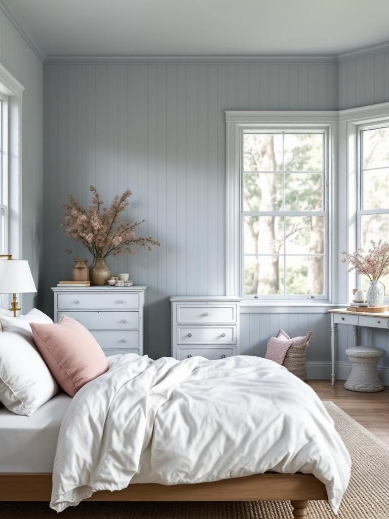
Country Air (an individual color from Dunn-Edwards: A Quiet Joy – color of the year 2026 group) is a timeless blue with a gentle hint of periwinkle; soft, soothing, and quietly uplifting. It’s the kind of color that feels best in spaces meant for slowing down, like a bedroom retreat, a reading nook, or a light-filled bathroom. Used on walls, beadboard, or even a painted dresser, it brings the calm of open skies indoors. Layer it with creamy whites, worn wood, and touches of dusty pink to create a space that feels personal.
Commit to one brand hue or develop a layered, complementary palette.
- Dunn-Edwards: DET581 RL#878
- Sherwin-Williams: SW 9138 Stardew
- Benjamin Moore: HC-144 Palladian Blue
- Behr: HDC-AC-23 Ocean Boulevard
- Valspar: 5006-9A Sea Salt Blue
- Farrow & Ball: No. 235 Borrowed Light
- Pantone: 16-4610 TCX Aqua Gray
Warm Mahogany (hex #764034)
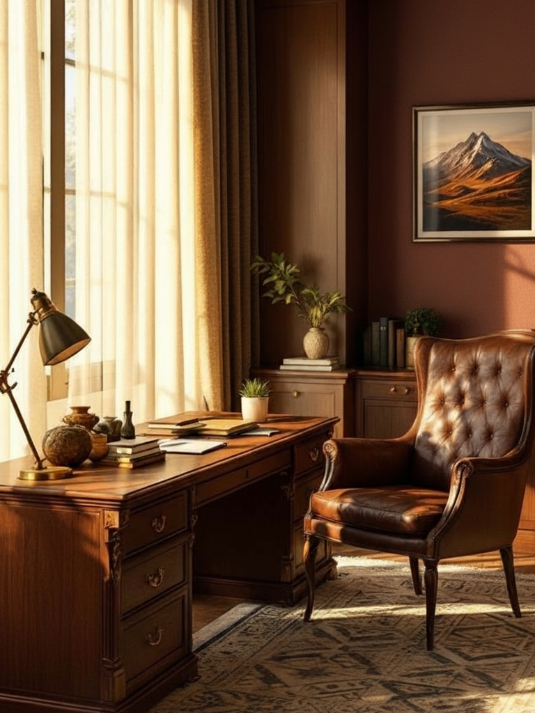
Warm Mahogany is a rich, earthy brown-red hue that evokes polished wood, vintage elegance, cozy interiors, and grounded warmth, blending timeless sophistication with natural depth and subtle rustic charm. It instantly adds gravitas, making modern rooms feel more rooted and intentional. Use it in dining rooms, studies, or on doors and millwork to transform the mood with a hit of heritage and warmth.
Design around a single hue or a carefully matched combination.
- Glidden: PPG1060-7 Warm Mahogany (Color of the Year 2026)
- Sherwin-Williams: SW 2838 Polished Mahogany
- Benjamin Moore: HC-64 Townsend Harbor Brown
- Behr: 170-7 Dark Cherry Mocha
- Valspar: 2002-9A Tavern Mahogany
- Farrow & Ball: No. W101 Deep Reddish Brown
- Pantone: 18-1425 TPG Mahogany
Melodious Ivory (hex #e4caad)
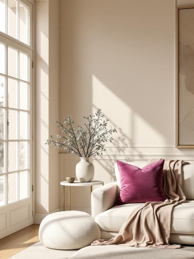
Melodious Ivory is a soft, warm neutral blending creamy beige and muted gold, evoking elegance, calm harmony, gentle light, and timeless comfort with a subtle, refined glow. Its understated character flatters architectural details and lets bolder textures, metals, and woods stand forward without noise. Use it to quiet busy rooms, bridge contrasting hues, or modernize traditional schemes with a whisper of warmth.
- Dutch Boy: Melodious Ivory (Color of the Year 2026)
- Benjamin Moore: OC-2 Pale Almond
- Sherwin-Williams: SW 7012 Creamy
- Behr: MQ3-43 CERAMIC BEIGE
- Valspar: 3007-6B Homey Cream
- Farrow & Ball: No. 203 Tallow
- Pantone: 11-4101 TCX Stalactite
Divine Damson (hex #431e22)
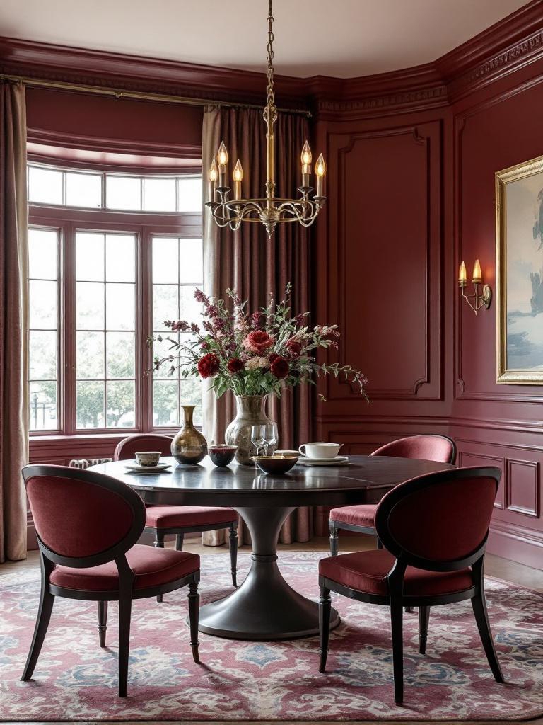
Divine Damson carries a plush, jewel-box sensibility, simultaneously moody and glamorous. It rewards low, layered lighting, turning walls into a backdrop for metals, glass, and rich textiles. Use it where you want an enveloping, boutique-hotel atmosphere – powder rooms, bedrooms, or statement dining spaces.
Start simple with one color or elevate it through blending.
- Graham & Brown: Divine Damson (Color of the Year 2026)
- Benjamin Moore: 2075-10 Elderberry Wine
- Sherwin-Williams: SW 6565 Fabulous Grape
- Behr: S-H-680 Purple Bloom
- Valspar: 1011-6 Ancient Burgundy
- Farrow & Ball: No. 297 Preference Red
- Pantone: 19-2118 TCX Winetasting
|
MUST READ: |
All AIs, One Palette: The Defining Colors of 2026
Once you line up all AI predictions side by side, something interesting happens: despite wildly different “personalities,” they keep landing on the same ideas. Not exact shades, but the same emotional lane. Best of all, we have TEN results, not NINE, as expected!
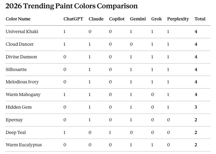
The top 10 colors reveal a remarkable consensus among AI platforms on the trending paint colors for 2026.
Six colors tie for first place with four mentions each: Universal Khaki, Cloud Dancer, Divine Damson, Silhouette, Melodious Ivory, and Warm Mahogany. This dominant group reflects a precise movement toward sophisticated neutrals, warm, earthy tones, and muted elegance.
Hidden Gem follows with three mentions, while Epernay, Deep Teal, and Warm Eucalyptus round out the top with two mentions each.
This trend highlights beautiful nature-inspired colors like warm browns, gentle greiges, rich burgundies, and lush greens. These shades create a cozy, grounding, and elegant atmosphere, moving away from flashy, bold colors.
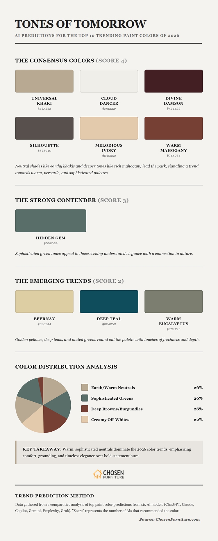
AI Chat’s Predictions for the Top 10 Trending Paint Colors of 2026
Why These Color Trends Actually Matter
What’s interesting about these trending paint colors of 2026 isn’t just how they look – it’s why they’re showing up now.
Across the board, there’s a clear move away from cold minimalism. Instead of stripping spaces down to nothing, people want rooms that feel expressive, layered, and real. Maximalism is creeping back in, but with restraint and intention.
Color psychology plays a big role here. Soft greens and warm neutrals create calm. Earthy reds and browns add comfort. Even darker shades are being used in a more thoughtful way – less “statement for shock value,” more “quiet drama.”
These choices reflect how our homes are used now. Post-pandemic, home isn’t just a place to sleep. It’s where we work, recharge, entertain, and hide from the world.
The colors trending toward 2026 acknowledge that reality. They aim to soothe without being boring and energize without being overwhelming.
Wellness isn’t a buzzword anymore – it’s baked into color choices. Calm, grounded palettes are no longer optional; they’re expected.
|
MUST READ: |
FAQ
What are the top trending paint colors for 2026?
Top paint colors for 2026 include Universal Khaki (hex #b8a992), Cloud Dancer (#f0eee9), Divine Damson (hex #431e22), Silhouette (hex #57504c), Melodious Ivory(hex #e4caad), and Warm Mahogany (hex #764034). Together, these shades balance softness and drama, reflecting a shift toward grounded, emotional interiors that feel timeless, versatile, and design-forward across homes, apartments, and contemporary renovations worldwide in 2026.
What colors are best for calming interiors in 2026?
For calming interiors in 2026, designers favor Cloud Dancer (#f0eee9) and Dusty Sage Green (#5f7769). These hues soften light, reduce visual noise, and create relaxed atmospheres. They work beautifully in bedrooms, living rooms, and open-plan spaces, pairing easily with wood, linen, stone textures, and warm metallic accents that feel inviting, modern, and emotionally balanced.
Which bold colors work best as accents in 2026 interiors?
Bold accent colors trending in 2026 include Inky Blue-Black (#0e1a24) and Warm Mahogany (hex #764034). These deep tones add sophistication, contrast, and depth without overwhelming a room. Used on feature walls, cabinetry, or trim, they elevate modern interiors while maintaining warmth, intimacy, and visual richness in residential spaces, boutique hotels, creative studios, and upscale urban homes.
Are earthy paint colors still trending in 2026?
Earthy paint colors remain central to 2026 trends, with Muted Terracotta (#be725a) and Universal Khaki (hex #b8a992) highlighted. These shades echo natural clay, soil, and sun-warmed landscapes. They create inviting rooms that feel grounded and authentic, supporting biophilic design, sustainability-focused choices, and emotionally resilient interior environments.
What neutral white paint colors are popular for 2026?
Neutral whites for 2026 lean warm rather than stark, with Cloud Dancer (#f0eee9) and similar soft whites leading palettes. These tones reflect light gently, avoid cold undertones, and complement trending earthy and dark accents. They provide flexible foundations for evolving décor, layered textures, and timeless interior styling across homes, apartments, rentals, renovations, and design-led spaces.
Final Thoughts
Some AI chats play it safe with colors. Others flirt with drama. When it comes to predicting the trending paint colors of 2026, bravery shows up in how far an AI is willing to move beyond crowd-pleasing neutrals into moody, opinionated territory.
At the cautious end, models lean on soft ivories, greiges, and familiar khakis – timeless, soothing, and almost impossible to argue with. Mid-ranking AIs introduce depth with earthy greens, teals, and cocoa browns, signaling confidence without shock value.
The boldest contenders go all in: inky plums, near-black blues, and saturated, emotionally charged hues that feel less like a “trend report” and more like a “design manifesto.”
In the end, the bravest AI chats don’t just predict what people already like – they dare to suggest what we might fall in love with next.
Test the colors. Live with them. Adjust as you go. The best rooms constantly evolve with the people inside them.



Add comment